October 06, 2022
Draw and Measurement Tool Improvements 🙌🏻
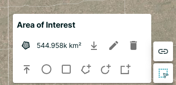
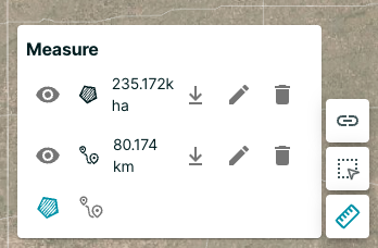
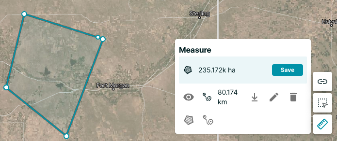
There are improvements to the draw and measurement tools in Planet Explorer. By default, you can view the size of your area of interest. You can also edit and download each drawn geometry, including the area of interest and the measurements.
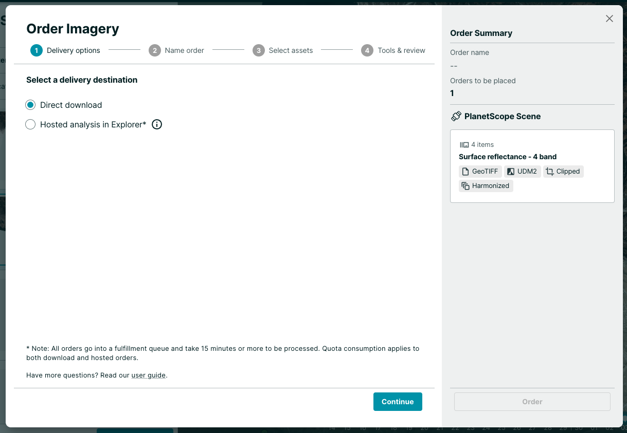
The orders steps are consolidated and you can now choose between "Direct Download" or "Hosted Data" on the first step of the dialog.
Raster Data in the Client with NumpyTiles
By: Dan “Ducky” Little on October 06 2022
Planet imagery is data-rich, using 12 bits per pixel. Web browsers only display 8 bits per pixel. So how about using NumpyTiles and those extra 4 bits to do remote sensing in the browser?
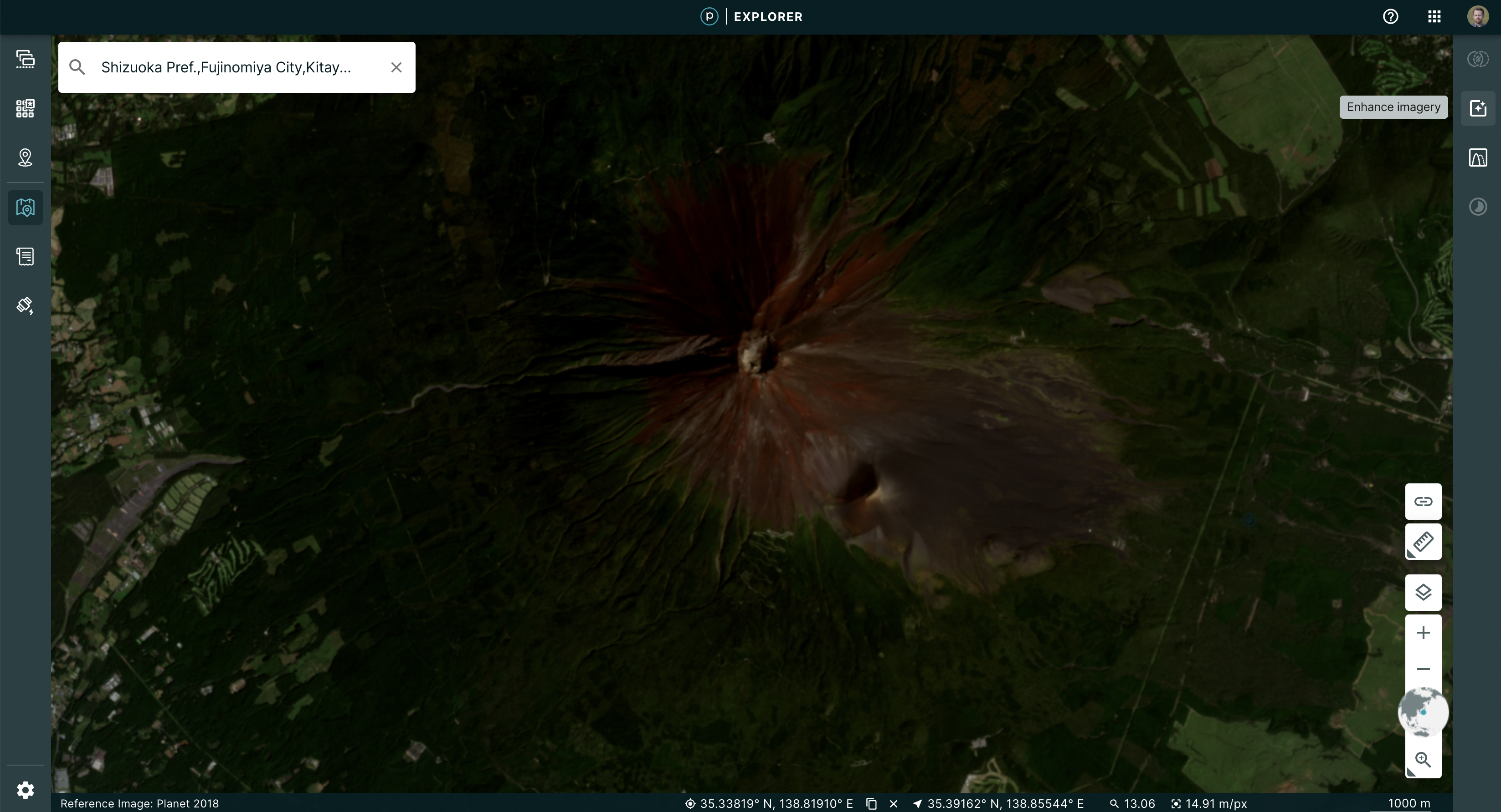
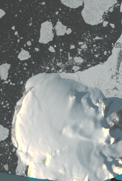
Atmosphere: it’s the one thing that anyone who works with visual data has to negotiate. To enhance visual imagery at Planet, we use processing techniques, such as color corrections, reducing the effects of atmospheric haze, sharpening, or adjusting pixels near scene boundaries to minimize the effect of scene lines. For a Planet Basemap, our automated processing uses a “best scene on top” methodology to select the highest quality scenes for use in a mosaic. This means, when you look at a Basemap, say in Planet Explorer, you see sharp images that contain the lowest cloud coverage.
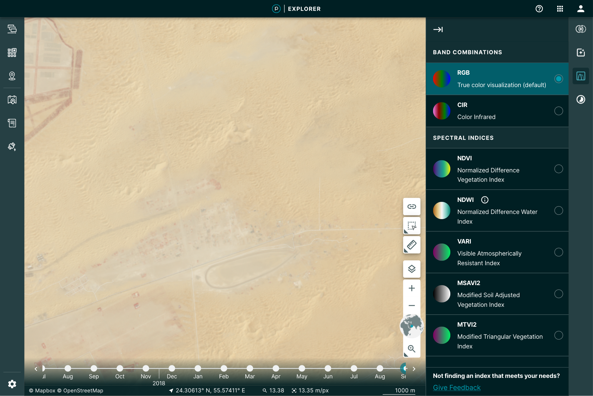
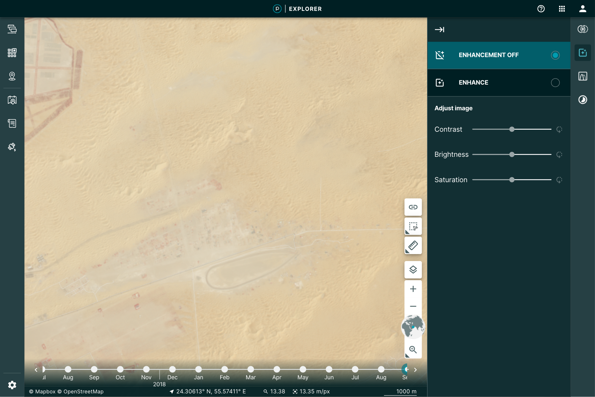
You may, however, want to manipulate the image a bit further for your particular use. You may want to play with the brightness, contrast, or saturation to pull out some detail. Planet Explorer provides a tool to do so called the Enhance tool.
 |
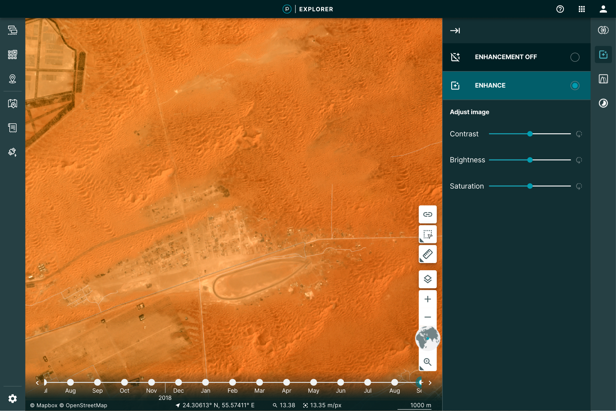 |
Even more, when you use the Image Enhancement Tool, you’re not just making a prettier picture, you’re actually doing remote sensing. This is because the image you’ve loaded is the actual data: all 12 bits per pixel. The red, green, and blue pixel data are used to display the browser-friendly colors. The other data are free to be used to perform the enhancement.
How’s it done?
Web browsers are an amazing way to get data into the hands of users. In the last 10 years, mapping applications through the browser have exploded. That explosion has pushed a number of innovations in vector formats. It has become easier than ever to take large data files of parcels, lakes, collections of millions of points, and stream them into the browser.
The same evolution has not been available to the wide range of raster data. When we display raster imagery in the browser, we’re limited to eight bits of data that define a color. This is called a true, or natural, color because it conforms to visual expectations–the colors you see in the world, for example, green grass or gray pavement. That’s what you’d expect the browser to display: the colors needed for a visual representation of the world. All web-browser image formats are limited to displaying Red, Green, Blue, and some transparency, to display that image in true color.
Remote sensing in the browser
Given that the browser is limited to eight bits for each one of these channels, we reduce the imagery’s extra bands of color and bit-depth down, by applying a “color curve” and selecting the true colors to use in the browser. Our “global” color curve is designed to work across all types of Planet data. Of course, there is no one-to-one mapping from 12-bits to 8-bits. So while the satellite is capturing lots of rich data, the global color curve addresses the most common imagery situations. This means some of that data, if it’s rarely used for representing most of the world, will not be visible in the color curve we use. Some imagery, such as the desert image above, may look washed out. But Planet's satellites are far more capable!
The imagery still has additional data that would be useful to manipulate in order to do remote sensing right in the browser. Working with only the RGB bits in the browser limits the ability to do raster-data based calculations, such as NDVI, or to see the images past that 8-bit limitation. To pass the large imagery data required for analysis to the browser interface requires getting that additional data through the network. Cloud Optimized GeoTIFFs (COGs) have helped show the potential of in-browser analysis with tools like geotiff.js. But COG's are not optimized for the web and have some limitations:
- COGs do not always have overviews. This then requires streaming the entire image into the browser from the server. Zoomed out, this means processing a lot of high resolution data for one view.
- Varying compression algorithms can create decoding issues, including overwhelming the client's CPU.
- COGs are not guaranteed to be in the same projection as the map, forcing the need for raster projection and opening the door for creating rectification issues.
- Here at Planet, we needed a technique that enables efficient streaming of multi-band, multi-byte data without the overhead of parsing a TIFF in the browser. Our solution? NumpyTiles.
What is NumpyTiles?
NumpyTiles is an open specification that Planet published on GitHub, designed to be both easy to serve and easy to parse on the client. “NumpyTiles” is a portmanteau of both “NumPy,” the popular Python numerical library, and “Tiles,” which refers to slippy-map tiles. Each NumpyTile is a NumpyArray which is 256 columns wide, 256 rows long, with any number of bands represented as additional dimensions to the array. NumpyTiles is compatible with any slippy map specification (WMTS, XYZ, TileJSON, OGC API - Tiles, etc), as it is just an alternate output format, like PNG or JPEG.
Planet open sourced OpenLayers NumpyTiles (ol-numpytiles) library to serve as a reference implementation that anyone can use. A demo of how this works can be found in the official OpenLayers examples as well as Planet Explorer.
Examples in Planet Explorer
The Enhance feature in Explorer is powered by NumpyTiles. The browser loads the images as NumpyTiles and applies the enhancements dynamically, based on the user’s viewport. This dynamic segmenting and loading provides the full range of relevant details for the pixels being displayed. The result is a more descriptive visualization of the data.
 |
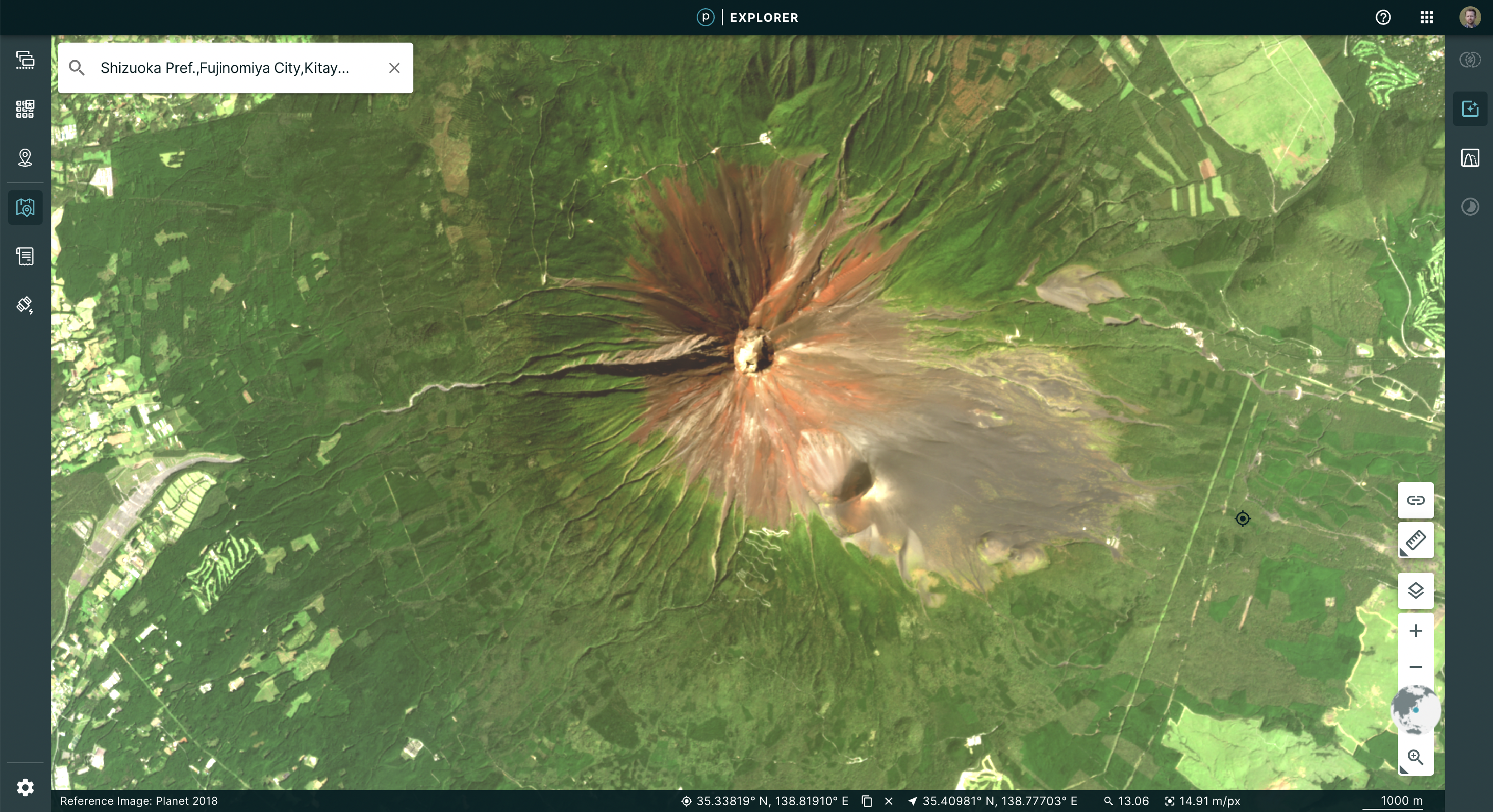 |
This is accomplished by leveraging the OpenLayer native WebGL rendering chain and lowering the amount of abstraction between “NumpyTiles” on a tile server and the rendered formats. This improved output allowed us to experiment with enhancement methods. Beyond the dynamic color curve, we could now add Brightness, Contrast, and Saturation sliders to update the image in real time, giving instant feedback to the user as to how their changes affect what they are seeing.
| No enhancement | Old enhancement | New enhancement |
|---|---|---|
 |
 |
 |
The Growing NumpyTile Ecosystem
TiTiler
Remember the old days when you prepared the raster data and then had to push a PNG of the file for display in the browser? Now, Titiler, pronounced tee-tiler (ti is the diminutive version of the french petit which means small), provides a set of simple python modules for building your own raster dynamic map tile services. TiTiler works with NumpyTiles, serving up any input data as NumpyTiles to be used in applications.
You can go even further, by using the Titiler.PgSTAC plugin to connect to a PgSTAC database and create dynamic mosaics based on a search query.
Unfolded Studio
Ready to conduct powerful geospatial data analysis from your browser? Unfolded Studio is a geospatial visualization tool that lets you create maps from your geospatial data, perform powerful analytics, share and publish maps, and much more. Check out their sample maps for inspiration. Their raster data support leverages NumpyTiles for rich interactions. This can be seen in their COG support, which uses TiTiler under the hood to convert COG’s to NumpyTiles, and their Planet NICFI integration, which uses NumpyTiles from Planet’s tile service.
Next steps
Check out the NumpyTiles spec and the OpenLayers Rendering 16-bit NumpyTiles JavaScript example. Let us know what you’re building on Twitter.
September 14, 2022
Improvements 🙌🏻
All data available in your area of interest is now visible. Previously, to narrow results a three month date range was auto-populated. With this change, all available data going back to the first capture is displayed. You can use the date range filter to narrow results according to your time of interest.
Bug Fixes 🐛
We have fixed some issues that caused the application to fail unexpectedly for some customers.
August 31, 2022
New ✨
- Navigate to your AOI without spending any tile view quota: when you first load Explorer you will see a Global reference image that you can use to find your area of interest.
- Only spend tile views once you find relevant date: We used to auto-select the most recent image. Now, once you create your area of interest, you will see the menu of data results and can select the data that meets your criteria. You will only start spending tile views once you select a data product. If you are loading a saved session from a shared link, you will see your selected image and use tile views for that.
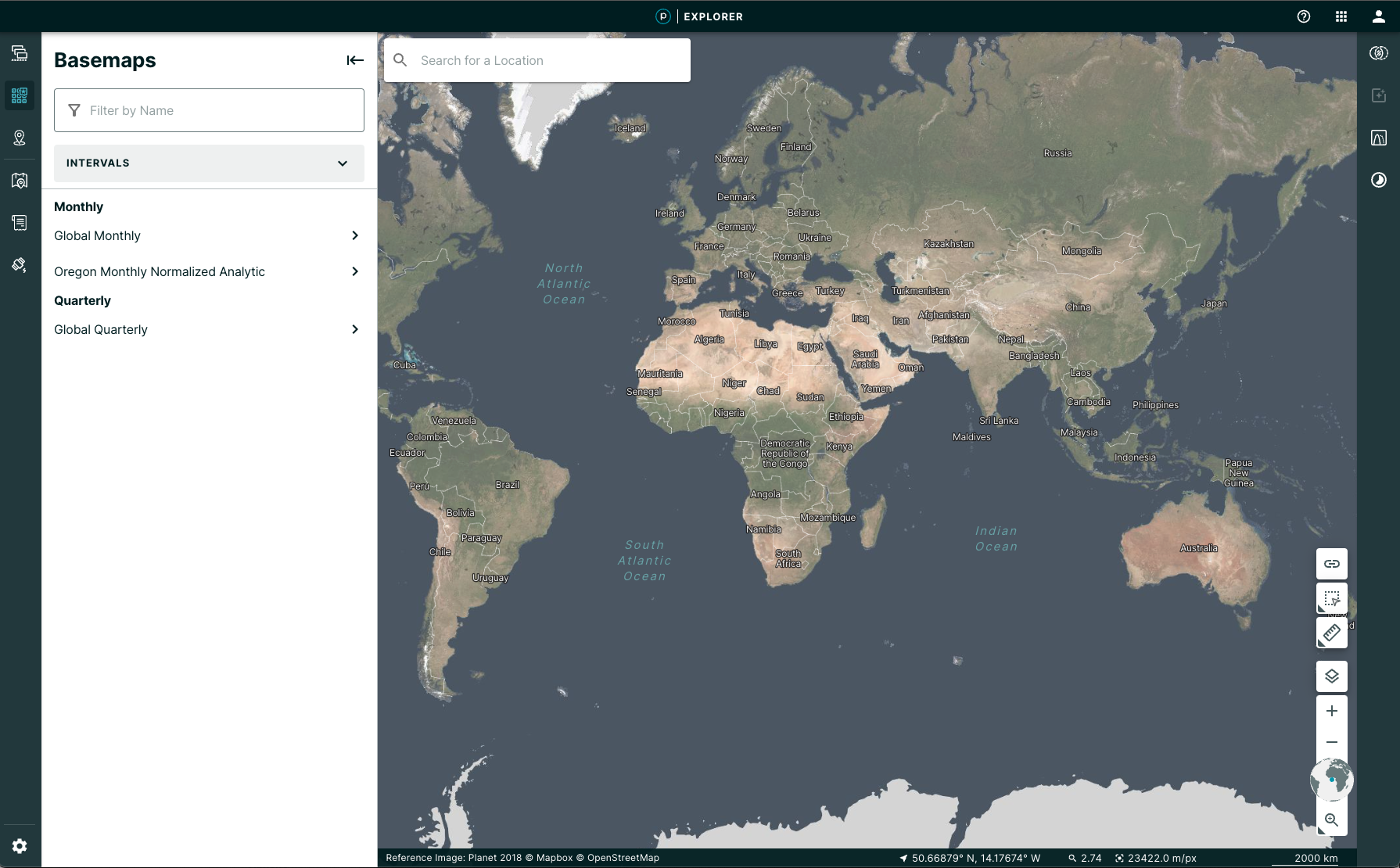
- Basemaps have a new home! They now have a dedicated sidebar with some improved filters.
- The search input to search for a location has also been moved to be in the map.