You can analyze imagery in the browser by taking measurements, comparing imagery side by side, enhancing pixels, applying spectral visualizations, and creating a timelapse. Measurement tools can be found on the map. All other analysis tools can be found in the toolbar on the right hand side.
Take Measurements
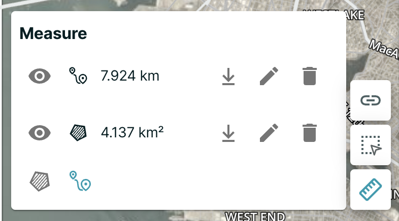
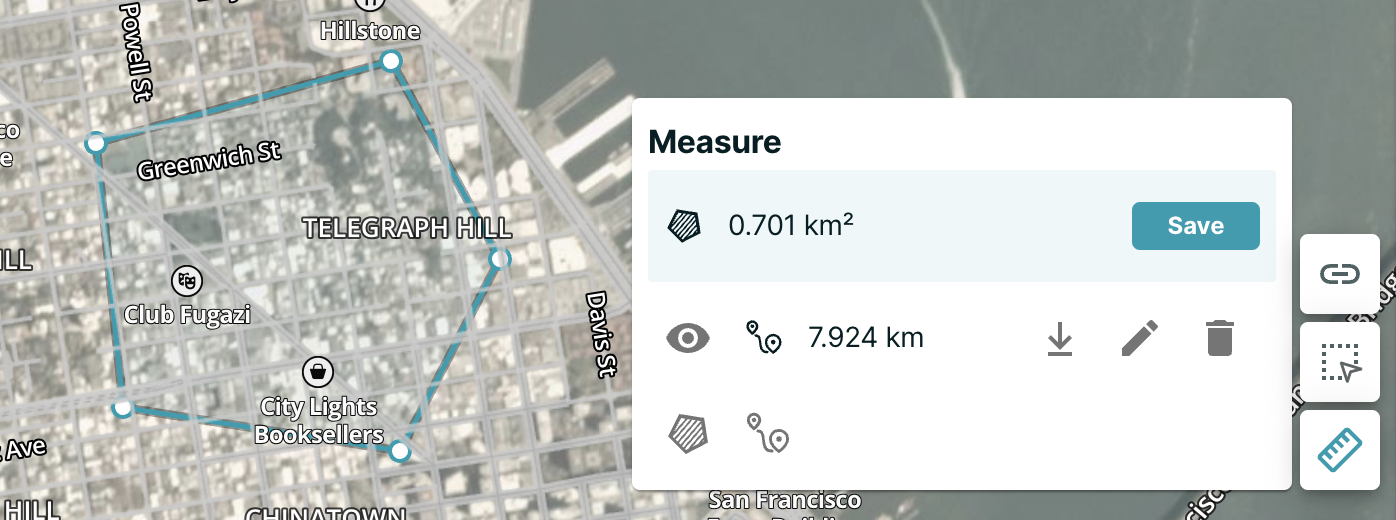
You can measure the distance between two points, the area within a polygon or the bearing of a drawn line.
The measure tools are on the bottom right hand corner of the map, below the Draw an AOI button. If you float over this icon, you will see these available tools:
The first icon from the left (a compass icon) is the Measure Bearing tool, which allows you to measure the bearing between two points on the map.
When you click on two points, the results are displayed on the map until you clear them. If required, continue to create sets of points and calculate their bearing.
Note: You can create multiple types of measurements on the map. For example, if you create a bearing measurement, and then choose to create an area measurement, both continue to be visible on the map and are managed as individual measurements.
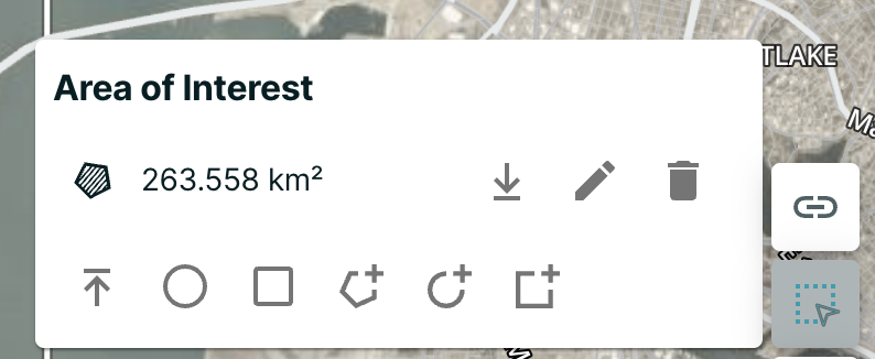
Using the Measure Area tool, you can measure, download, edit, save or delete drawn geometries and measurements including the area of interest (AOI).
The last icon (a ruler icon) is the Measure Distance tool. When prompted, Click to create segments. To create a segment: 1. Hold shift to draw free-hand. 2. Click twice in the same location to end. 3. After you create one or more segments, double click to end the line measurements.
The line turns white, and a final distance is displayed. You can create multiple measurements on the map.
Comparing Imagery
You can compare sets of Planet imagery from different days, months, and quarters side by side.
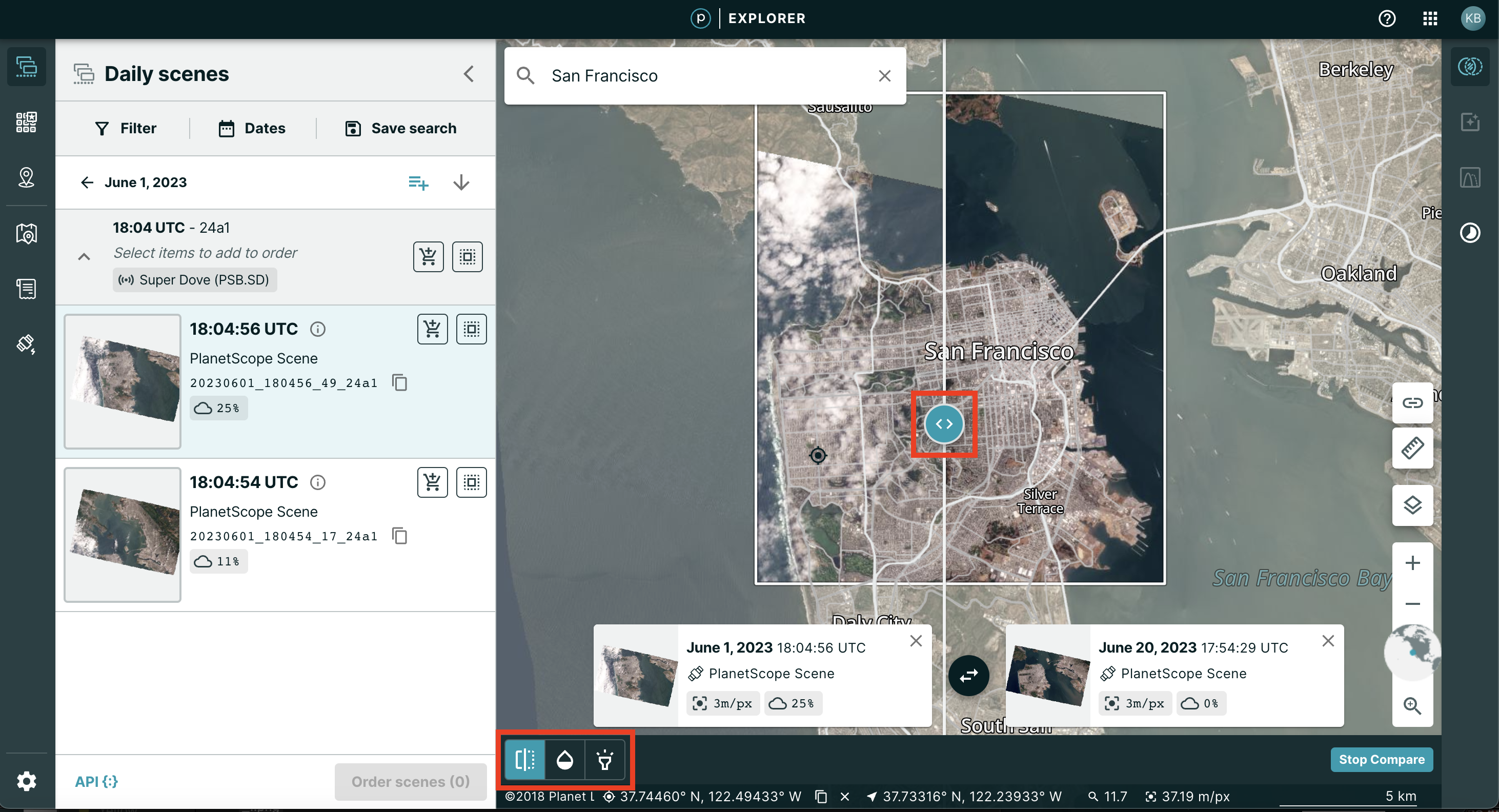
In the toolbar on the right hand side, you will see the Compare icon at the top of the stack. When you click the Compare icon, the map view changes, and you see a prompt to Drag & Drop Images to Compare.
![]()
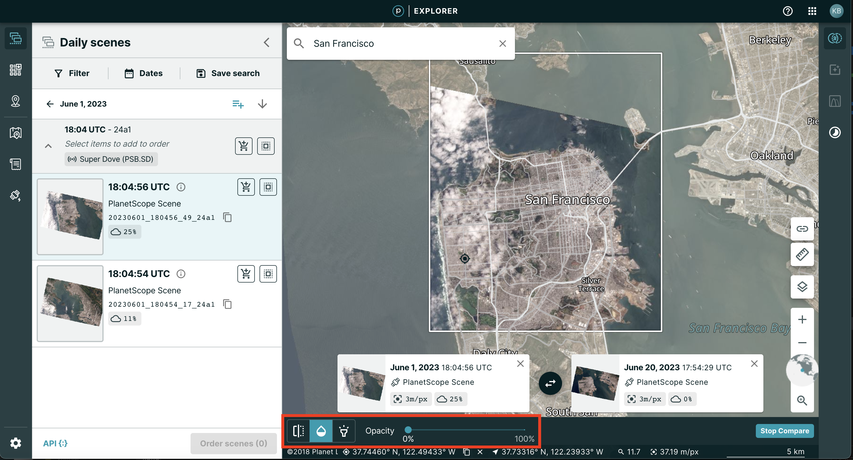
Click and drag any image from the left pane, and release when on top of the map view. You can see the information box in the top center describes the image that has been added to the map view. Repeat again with a second image from the list in the left pane.
Now you can see two images have been added to the map view, and a slider bar is visible in the middle of the map view. The image on the left side of the slider icon corresponds with the tile description at the top left, and similarly for the image on the right side and the corresponding tile description on the top right.
By clicking on the slider icon and moving the mouse left or right, the map interface changes, and you can compare the two images that have been stacked one atop the other.
The icon in the top middle indicates that you can swap the imagery overlay (so that the bottom image becomes the top image).
To swap the image on the map view with a new image, simply click and drag a new image to the map view, and drop in the proper quadrant to replace the image you don't want to compare anymore.
When comparing imagery, there are two tool icons in the bottom left stack - Slide and Opacity.
Slide
This is the default option selected as you choose the Compare tool. This controls the slider bar allowing you to view two images stacked atop each other.
Opacity
If you choose the Opacity option, you will see the top left image along with an Opacity slider bar at the bottom of the map view.
As you slide the Opacity bar to the right, the top image will fade, and the features of the bottom image will start to become visible.
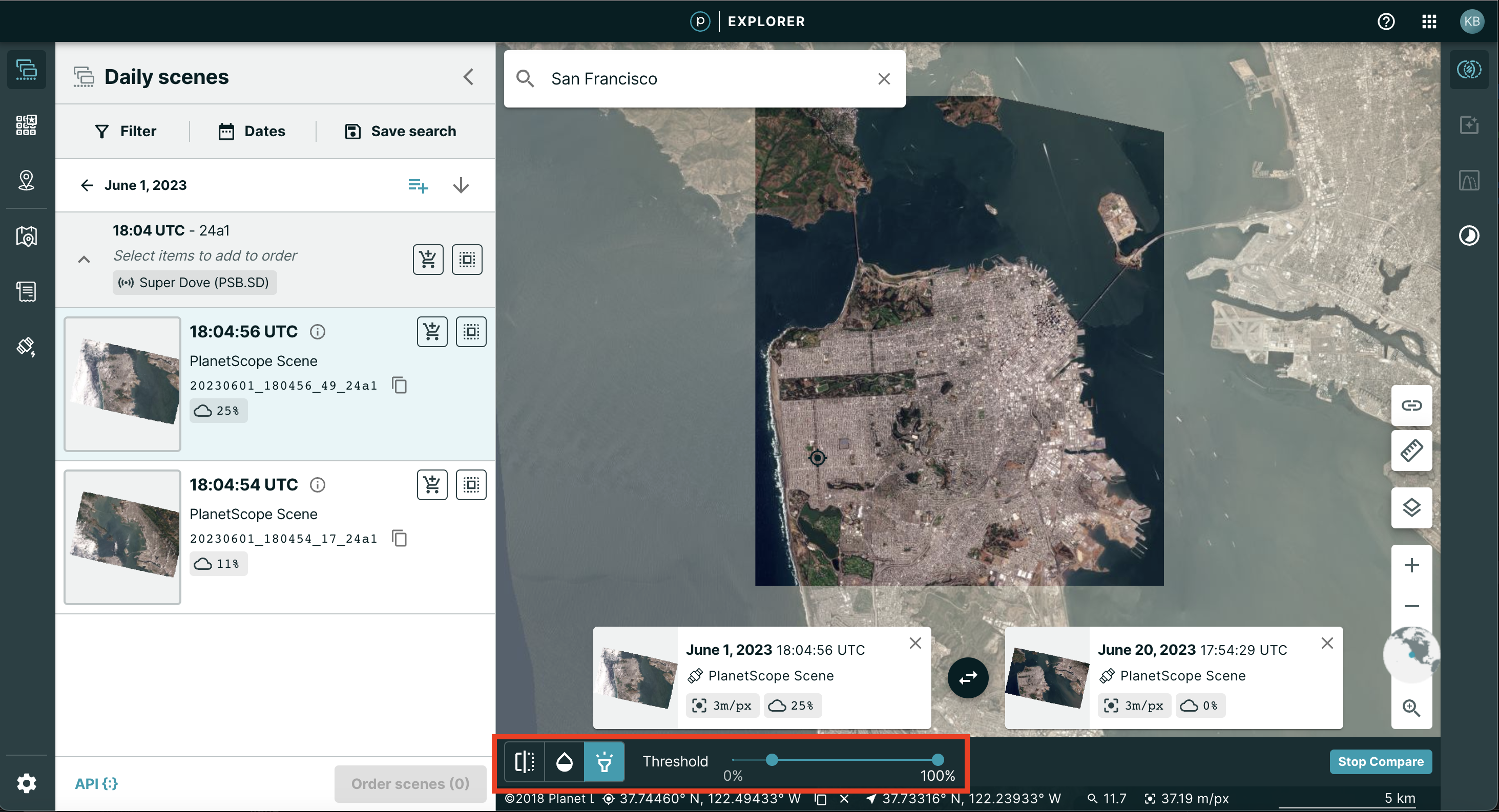
Relative Luminance
If you choose the relative luminance option, you will see the top left image along with a threshold range slider bar at the bottom of the map view.
This will highlight the pixel difference between the two images. The formula used can be found here.
Enhance Pixels
You can enhance Planet's data to adjust for contrast, brightness, and saturation.
Data Guideline
You can use pixel enhancements with our basemaps (surface reflectance basemaps work best) as well as with daily scenes (you must order hosted data).
Select Enhancement
Select enhancements from the right-hand toolbar. The enhance button is the second icon from the top. The tooltip should read Enhance imagery.
To enhance imagery, you can choose from pre-set filters or adjust more granularly to your own liking.
Preset modes include:
- Auto enhancement: recommended for most use cases
- Snow: recommended for icy and snowy areas that are typically washed out
- Desert: recommended for desert areas that are typically washed out
Custom enhancement filters allow you to adjust for contrast, brightness, and saturation. Adjust by moving the slider to the right or the left.
You can also adjust for contrast, brightness, and saturation by adjusting points on the histogram. Turn the histogram toggle on and click on the points to adjust. If you enhance imagery via the histogram, you may use the sliders on top of your histogram adjustments for post-processing.
Apply Spectral Visualizations
Select visualizations from the right-hand toolbar. The visualizations button is the third icon from the top. The tooltip should read Perform spectral analysis.
If you would like advanced tools to analyze the imagery beyond the Red-Blue-Green spectrum, you can use the spectral visualization tools. These tools take advantage of the spectral band information that Planet captures.
Data Guideline
You can use spectral visualizations with surface reflectance basemaps as well as with daily scenes (you must order hosted data).
Choose your Visualization
The visualization tools are located in the toolbar on the right hand side. When you click on the third icon in the toolbar, you will see a menu of visualizations to choose from.
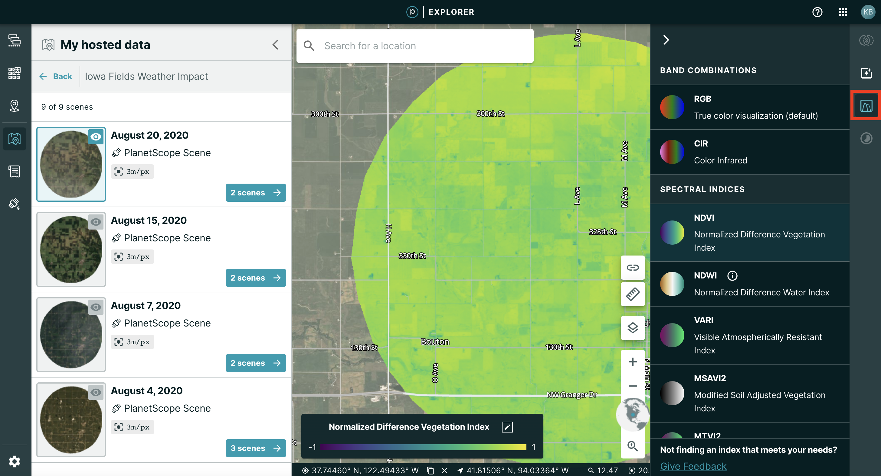
The menu of visualizations includes:
- RGB: Red Green Blue
- CIR: Color-infrared
- NDVI: Normalized Difference Vegetation Index
- NDWI: Normalized Difference Water Index (please note that Planet calculates NDWI using NIR rather than SWIR)
- VARI: Visible Atmospherically Resistant Index
- MSAVI2: Modified Soil Adjusted Vegetation Index
- MTVI2: Modified Triangular Vegetation Index
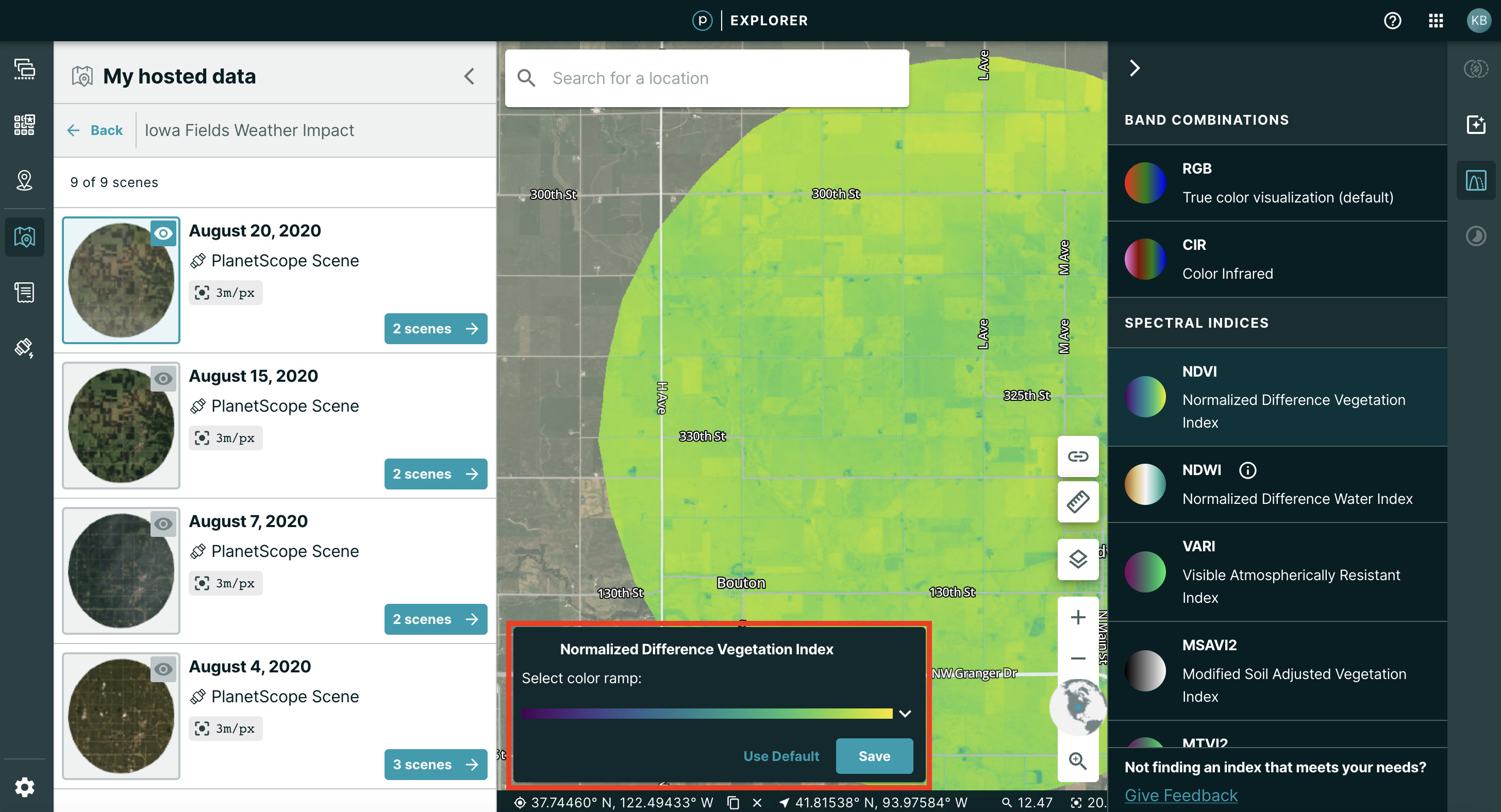
Changing the color ramp:
If you click CIR, your basemap visualization will change automatically to be color infrared. If you click NDVI, NDWI, VARI, MSAVI2, or MTVI2 you will have the option to select your color ramp in a pop-up in the bottom left-hand corner. Click the edit tool in the upper right hand corner of the pop-up. Click the carrot indicator to view your options. Once you have selected a color ramp, you can save your preferences by clicking “Save”. Your imagery will then reflect the color ramp you chose.
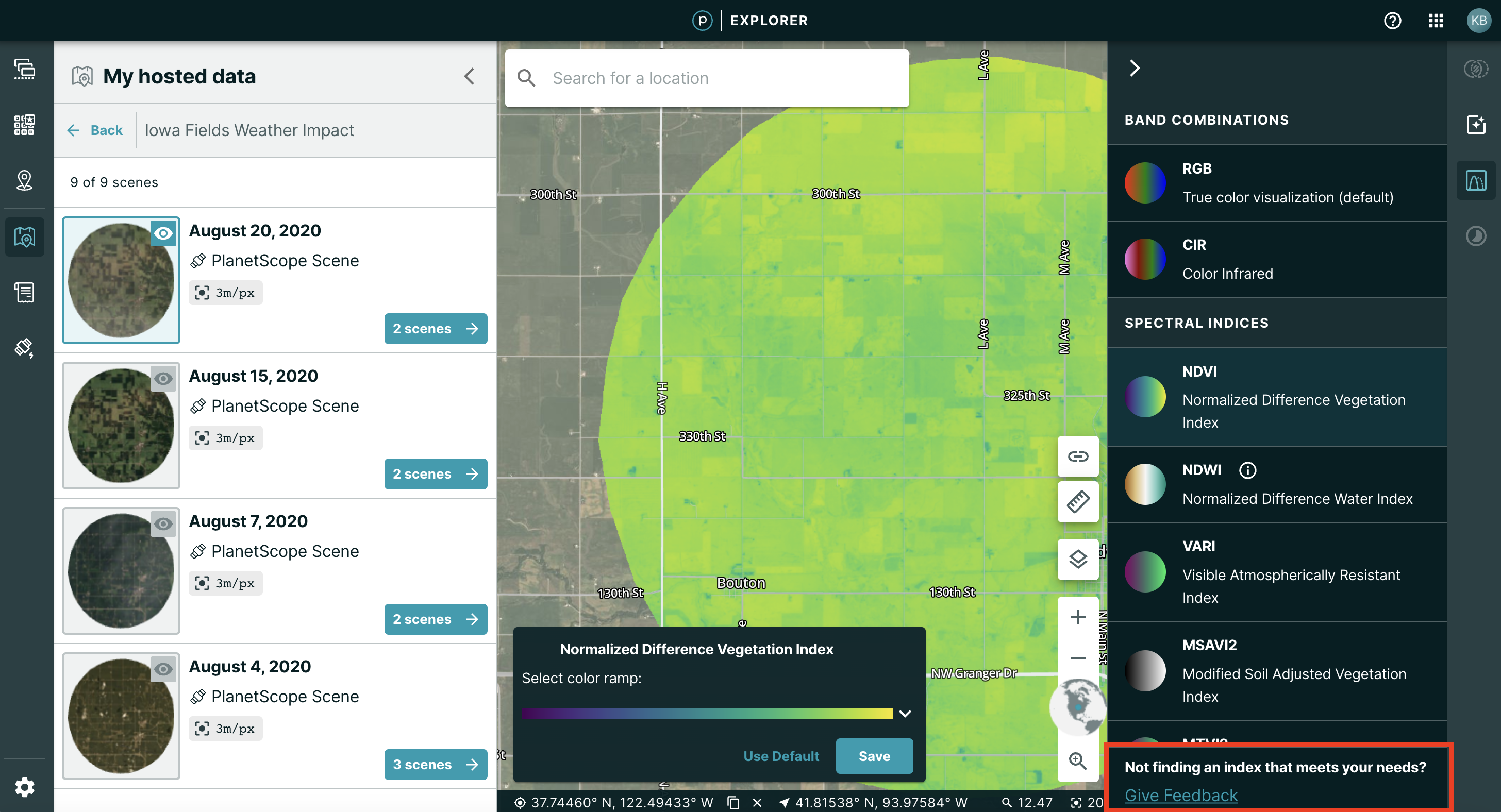
To view any other indices or band combinations that we do not feature yet, submit your request by clicking the link that reads "Not finding the index that meets your needs? Give Feedback". This will take you to a Google Form where you can tell us more about what you would like to see. We may follow up with you if we have additional questions.
Try Demo Data for Pixel Enhancement and Spectral Visualizations
If you are not ready to order hosted data for your area and time of interest or if you do not yet have access to surface reflectance basemaps, you can try out our tools using Planet's demo data.
Basemaps: If you are not currently viewing a Surface Reflectance Basemap, you will see a notification that prompts you to switch to a Surface Reflectance Basemap when you click on a tool in the toolbar. If your organization has purchased access to multiple Surface Reflectance Basemaps, you will see a list view. If your organization has not purchased any Surface Reflectance Basemaps, you will have the option to view a demo Surface Reflectance Basemap. You can also purchase a Surface Reflectance basemap online with your credit card by clicking Purchase.
Daily Scenes: To try demo data, go to the left hand navigation and click on the third icon down. The tooltip reads Access your hosted data for analysis.
Once you click on the icon, you will see a fly out with the option to choose My Folders and Demo Data. Click on Demo Data to see a list of Folders. Folders are organized by examples relevant to industry and geographic areas. Once you find a Folder that sounds interesting to you, click on the Folder to view the imagery in the Folder. Click on the image and go to the tools in the right-hand toolbar to apply visualizations or enhancements.
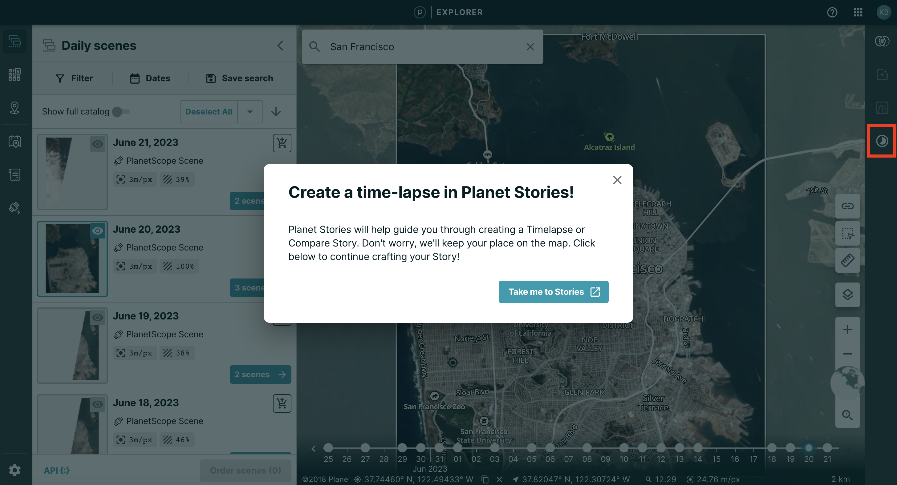
Create a Timelapse
If you would like to compare multiple images over time, you can create a timelapse in the Stories application.
Click the Stories icon in the right hand toolbar, at the bottom of the stack. When you click the icon, a pop-up opens with a link to the Planet Stories application. In Stories, you can make timelapses of multiple images. You can also publish your timelapses on the Planet website or on your own website or social media account.
We are continually working to improve our technical documentation and support. Please help by sharing your experience with us.