Simplifying Your Complex Area of Interest: a Planet Developers Deep Dive
By: Sean Gillies on December 15 2022
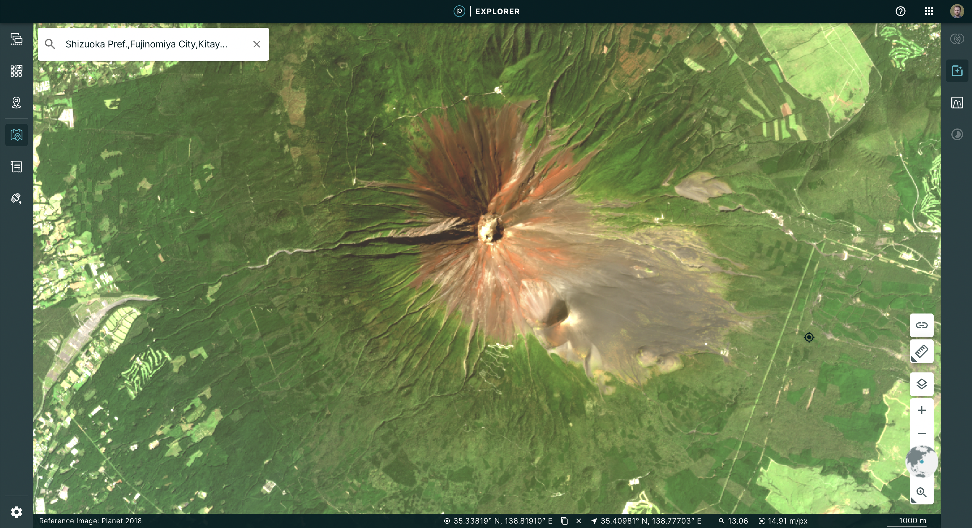
While your area of study may be very complex, a simplified representation of it works best with Planet’s platform.
Introduction
Planet’s APIs use spatial information on both ends, input and output. You can filter data catalog search results by comparing items to an area of interest. You can point a SkySat at the region on Earth that you are studying. You can order products derived from these sources and have them clipped to spatial boundaries that you provide. Planet Data API search results are represented using GeoJSON features. This allows the footprints of, e.g., PlanetScope scenes, to be viewed on a map along with your area of interest.

The shapes of these areas of interest, regions, and boundaries could be simple as triangles and squares or could be less perfect and more intricate agricultural fields or watersheds. The complexity of these shapes can adversely impact your experience as much as their area does, adding time to your analysis . But don’t worry—this post will help you understand how to analyze and treat that complexity so that you can get the most out of Planet data.
What do we mean by complexity?
By and large, the shapes of features on Earth’s surface are represented in Planet APIs by GeoJSON geometry objects. A triangular shape on the ground, for example, is represented by a JSON object with two members. The first member is a coordinate array consisting of three unique points (pairs of numbers) plus the first point, repeated to explicitly close the coordinate sequence. The second member is type, which has the value Polygon.
{
 "coordinates": [
   [
     [
       -1.859709,
       15.634462
     ],
     [
       -3.933013,
       12.424525
     ],
     [
       -0.423789,
       12.315333
     ],
     [
       -1.859709,
       15.634462
     ]
   ]
 ],
 "type": "Polygon"
}
By complexity of a shape, we mean the number of edge segments or the number of coordinate pairs that are the boundaries of the segments. A square polygon has five such coordinate pairs, which we will refer to as vertices. One coordinate pair is a vertex. More realistic polygons might have 100 vertices or more. A shape with more vertices is more complex than a shape with fewer. Imagine a copy of the triangle above, but with one additional vertex added midway along one side, collinear with the original points on that side. This new polygon has the same area as the original triangle and is more or less equivalent to the original as far as common algorithms are concerned. Its domain (internal connected region) is the same as the triangle’s domain. But it is more complex due to the extra vertex. Complexity increases with each additional vertex, and complexity comes with a cost.
Even more about complexity
Why did we say that the complexity of shapes adversely impacts your experience? The algorithm we use to implement Orders API clipping involves reducing your clipping shape into a set of triangles. The time it takes to compute this triangulation is on the order of n * log(n), where n is the number of vertices of the clipping shape. In other words, it takes about 15 times longer to clip using a 100-vertex shape compared to 10-vertex shape. And 13 times yet longer to scale from 100 to 1000 vertices. This is a fact of life for geographic information systems: even our best general-purpose geometry algorithms struggle with complex shapes.
Computing the bounding box of your shape—as is done in Data API search and Tasking API orders—takes time on the order of n, where n is again the number of vertices. Complexity affects these operations almost as much as it affects clipping. It takes about 10 times longer to compare a 100-vertex shape to Planet’s catalog compared to a 10-vertex shape.
The greatest impact on your experience, however, is due to the cost of copying and passing long arrays of coordinates throughout Planet’s systems. Data transfer, whether from disk to memory, or across a network, is orders of magnitude slower than operations in a computer’s CPU. Shape data volume increases with the number of shape vertices: this is a fact of life. The more complex your shapes, the slower your search, order, and subscription results.
What about the area of shapes? Is this property not significant? Planet’s catalog is spatially indexed. The time to find results increases only slightly with the area of your shape. The area of a shape relative to the ground resolution of Planet product pixels affects search response time mainly by yielding more results that must be serialized and sent back to you. The area of your shapes thus affects your experience, but it is a different problem from the one posed by shape complexity.
Planet APIs constrain the complexity of your shapes so that you don’t have the experience of being in computational limbo. Data volume is not directly correlated to the area of your shapes and so area is not explicitly limited. Data API search requests are limited to 1MB in size, which limits the number of vertices of search shapes in these requests. Orders and Subscriptions API clip shape vertices are limited.
However, the Orders or Subscriptions API clip tool is most valuable whenever you have areas of interest that are small compared to the size of Planet imagery scenes. Use it, because it reduces the time to apply other tools like bandmath and harmonization, and reduces the amount of data you need to download. The important thing is to manage the complexity of shapes that you provide in requests, using only as much as needed to get good results.
Managing complexity
Now that we’ve defined complexity and its impact, let’s consider how to manage complexity. Our goal with managing complexity is to create a simpler shape that covers the entire original area while increasing total area as little as possible.
Counting vertices
The first step is measuring the complexity of your area of interest. Specifically, this means counting the number of vertices. ArcGIS and QGIS allow this through their expression engines as !shape!.pointcount and num_points($geometry), respectively. QGIS also exposes this as a derived attribute of all features. In PostGIS, you can use the function ST_NPoints.
In a Python program you can count vertices using the Shapely library. Here is an example that uses recursion.
def vertex_count(obj) -> int:
   """"Count the vertices of a GeoJSON-like geometry object.
   Parameters
   ----------
   obj: a GeoJSON-like mapping or an object that provides __geo_interface__

   Returns
   -------
   int

   """
   shp = shape(obj)
   if hasattr(shp, "geoms"):
       return sum(vertex_count(part) for part in shp.geoms)
   elif hasattr(shp, "exterior"):
       return vertex_count(shp.exterior) + sum(vertex_count(rng) for rng in shp.interiors)
   else:
       return len(shp.coords)
If your shape is within the vertex limit, you can use it as an Orders or Subscriptions API clip geometry with no modifications.
If your shape has fewer than about 20,000 vertices, you can use it for a Data API search with no modifications. This is because the Data API strictly limits search requests to 1MB of JSON text. You can assume each vertex, or coordinate pair, is represented in the GeoJSON by 40-46 bytes of text with each coordinate printed to 15 decimal places of precision (the default of OGR and QGIS). Given the 1MB limit and the amount of text required per vertex, this sets a rough upper limit of 20,000 vertices.
Reducing complexity
The recipe we suggest for reducing complexity is this: Dissolve internal boundaries in your area of interest. If that doesn’t bring your area of interest under the limit, compute the convex hull. *Buffer to compensate for concavities or use the latest in outer concavity algorithms. If your area of interest has too many vertices, the first thing to check is whether redundant interior vertices can be eliminated by dissolving parts of your area of interest into a larger whole. For example, your area of interest might be a set of adjacent districts, watersheds, or zones extracted from other imagery. These shapes may share edges and vertices along those edges. Consider this map of Rocky Mountain National Park’s (RMNP) wilderness patrol zones. These 25 zones share boundaries and have redundant vertices.

This area is interesting in that some of its boundaries follow natural features of the landscape and some are purely matters of real estate. It is several PlanetScope scenes high and about one scene wide. The 25 zones cover 1081 km² and are described by a total of 28,915 vertices. The vertices are spaced about 10-20 meters apart along the zone boundaries.
This area of interest is not suited for search or clipping in this form. It is too complex. QGIS’s dissolve geoprocessing tool can eliminate 24,302 of these vertices along the interior boundaries, yielding a single shape with 5613 vertices. ArcGIS also has a dissolve tool. If you’re managing areas of interest with PostGIS, you can use ST_UnaryUnion. In Python, shapely provides unary_union. All of these are capable of dissolving areas of interest before Planet searches, orders, or subscriptions are made.

An 80% reduction in the number of vertices without losing any area is a step in the right direction. You could search with this new shape, it is well under the 1 MB size limit, but 5613 is still beyond the vertex limits for other Planet APIs. Fortunately, we have more cards to play. We can use simpler approximations of our areas of interest.
Convex hull
The smallest convex set that contains a shape is called its convex hull. The boundary of the convex hull of your area of interest looks like an elastic band stretched around it. It is an excellent approximation for mostly convex shapes as it hugs (for example,headlands), but less excellent for shapes with concavities as it fills in (for example, bays).

A useful property of the convex hull is that it covers every point in your area of interest. When it comes to searching and clipping, this means that you will find every catalog item that you would have found with the shape of your complex area of interest and will get every bit of data in your order or subscription that you would get if you could use your exact area of interest. A convex hull is radically less complex than the shape it surrounds. In this example, it is only 43 vertices. 99.9% of the original complexity has been removed. Planet API requests using this simplified shape will be speedily processed.
On the other hand, a convex hull is necessarily larger in area than your area of interest. In the present example, we have a +18% increase in area. That translates to a small chance of false positive search results: finding a Planet scene which intersects a filled-in “bay,” but not any of the original zones. It also means you’ll download data in those same filled-in regions that you may not use. In this example, 191 km² more.
Convex hull, the sequel
It turns out that one way to get a better approximation of your area of interest is to use even more convex hulls. If you take the convex hull of each zone separately and then dissolve those 25 convex hulls, you get a shape that hugs the original boundary more tightly. 99.4% of the complexity has been removed while only increasing the area by 5.7% (62 km²). This union of hulls is a great fit for Data API searching and Orders and Subscriptions API clipping.

Simplified buffers
If your area of interest is dominated by concavities, the convex hull approach may not be useful at all. For example, the convex hull of an N or Z-shaped region is a full rectangle and maximizes the number of false positive search results and extra clipped data volume. In such cases, we’ve often recommended the approach of buffering and then simplifying areas of interest because the outcome can follow the outline of the original concave shape better than a convex hull can.

The difficulty with buffering and simplifying is that there are more parameters to adjust compared to the convex hull approximation. Success can vary greatly depending on these parameters and on the complexity of your area of interest.
By simplification, we mean removal of vertices from the boundary of a shape, leaving the most important ones. The Visvalingam–Whyatt algorithm (ref TODO) uses local area-based criteria for importance. The widely used Douglas-Peucker algorithm has global distance-based criteria.
Imagine the original vertices of the boundary of your area of interest and the line segments between them, and another smaller set of vertices and line segments which approximates that boundary. The Hausdorff distance is the distance that we would need to dilate each of these sets so that they mutually cover each other. Given a distance like this, the Douglas-Peucker algorithm finds a simplified set of vertices that has an equal Hausdorff distance. Both algorithms result in loss of boundary detail, erosion of convex corners, and filling of concave corners. Erosion of convex corners has an impact on Data API search and Orders and Subscriptions API clipping: searches may miss items in the catalog and pixels may be missing from delivered data. Thus, simplification must practically be preceded by buffering.
The shape buffering operations offered by ArcGIS, QGIS, PostGIS, and Shapely have parameters setting the number of buffer segments around shape corners and the distance of these segments from the original shape. The effect of buffering on complexity is somewhat complicated. A buffer operation is constructive and creates a new shape with an entirely new set of vertices. More vertices are necessarily created around corners of the original area of interest. If you buffer a point and specify five segments per quarter circle around the point (the QGIS default, it’s eight for PostGIS), you get a 20-sided polygon (an icosagon) with 20 vertices. For buffer distances that are large compared to the distance between vertices, you’ll observe that buffering reduces complexity. In the extreme, a buffer shape approaches that which you would get when buffering a point.

Such a large buffer is useless in practice. You’ll want to use buffer distances smaller than the size of the area of interest so as not to unnecessarily inflate its area. However, for buffer distances that are the same order of magnitude as the distance between original vertices, or smaller, you’ll observe that buffering tends to increase complexity. On convex corners, 1-10 extra vertices may be created. Inversely, some vertices may be removed at concave corners. For the relatively small buffer distances that we are likely to use, the net result is to increase complexity. Buffering the RMNP zones by a distance of 100 meters and using five segments per quarter-circle gives a shape which has 598 more vertices (+11%).

If you subsequently perform a Douglas-Peucker simplification (available from ArcGIS, PostGIS, QGIS, Python, and other software) with a tolerance less than or equal to the buffer distance, extra corner vertices will be removed and some non-corner vertices will also be removed. Using a tolerance greater than the buffer distance is likely to result in loss of some of your area of interest due to convex corner erosion.
The best practice for buffering, simplifying, and not creating too many new vertices is this: use a buffer distance larger than the distance between vertices of your original shape. simplify using a tolerance that is no larger than the buffer distance.
Outer concave hulls
The future of approximating the shapes of areas of interest which have both convexities and concavities is the outer concave hull. Version 3.11 of the GEOS library provides an outer concave hull algorithm. This feature is thus coming soon to QGIS, PostGIS, and Shapely 2.0.0.
Below is a short script which uses an unreleased version of Shapely (2.0rc1) to construct the concave hulls of Rocky Mountain National Park’s Wilderness Patrol Zones, dissolve them, and write the results to a GeoJSON file which can be opened and displayed in QGIS.
import json

import fiona
from shapely.geometry import mapping, shape
from shapely import concave_hull, unary_union

with fiona.open("Wilderness_Patrol_Zones.shp") as collection:
   hulls = [concave_hull(shape(feat["geometry"]), ratio=0.4) for feat in collection]

dissolved_hulls = unary_union(hulls)

feat = dict(type="Feature", properties={}, geometry=mapping(dissolved_hulls))

with open(
   "dissolved-concave-hulls.geojson",
   "w",
) as f:
   collection = json.dump({"type": "FeatureCollection", "features": [feat]}, f)

This concave hull hugs the area of interest more closely than the convex hull and still has the important property of an outer hull: every point in the original area of interest is covered.
Conclusion
When your area of interest is overly complex, there are tools available to handle the complexity and maximize the value of Planet's platform. Desktop GIS software and programming libraries can measure the complexity of your areas of interest and provide tools to help you simplify your shapes to meet the vertex limit of Planet APIs: convex hulls, simplified buffers, and concave hulls. Today, convex hulls and simplified buffers are the most accessible methods. In the future, concave hulls may make the less predictable simplified buffer approach obsolete.
Next Steps
Check out our new simplification helpers in Planet Explorer. Let us know of any interesting simplification workflows you’ve done by Tweeting us @PlanetDevs. Sign up for Wavelengths, the Planet Developer Relations newsletter, to get more information on the tech behind the workflows.
Raster Data in the Client with NumpyTiles
By: Dan “Ducky” Little on October 06 2022
Planet imagery is data-rich, using 12 bits per pixel. Web browsers only display 8 bits per pixel. So how about using NumpyTiles and those extra 4 bits to do remote sensing in the browser?
Atmosphere: it’s the one thing that anyone who works with visual data has to negotiate. To enhance visual imagery at Planet, we use processing techniques, such as color corrections, reducing the effects of atmospheric haze, sharpening, or adjusting pixels near scene boundaries to minimize the effect of scene lines. For a Planet Basemap, our automated processing uses a “best scene on top” methodology to select the highest quality scenes for use in a mosaic. This means, when you look at a Basemap, say in Planet Explorer, you see sharp images that contain the lowest cloud coverage.
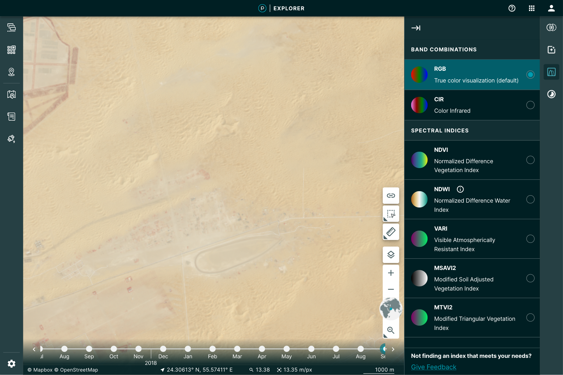
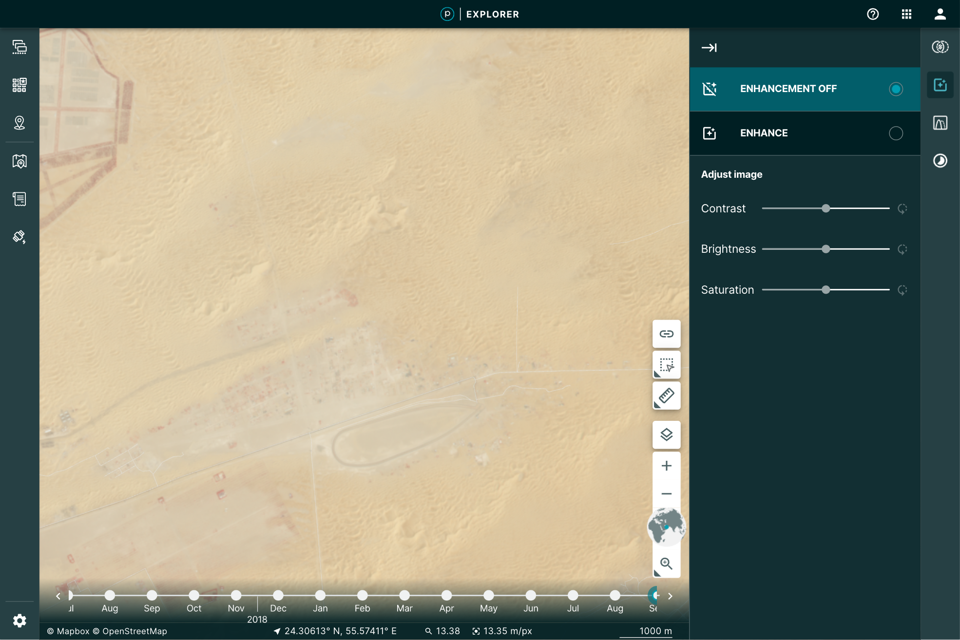
You may, however, want to manipulate the image a bit further for your particular use. You may want to play with the brightness, contrast, or saturation to pull out some detail. Planet Explorer provides a tool to do so called the Enhance tool.
 |
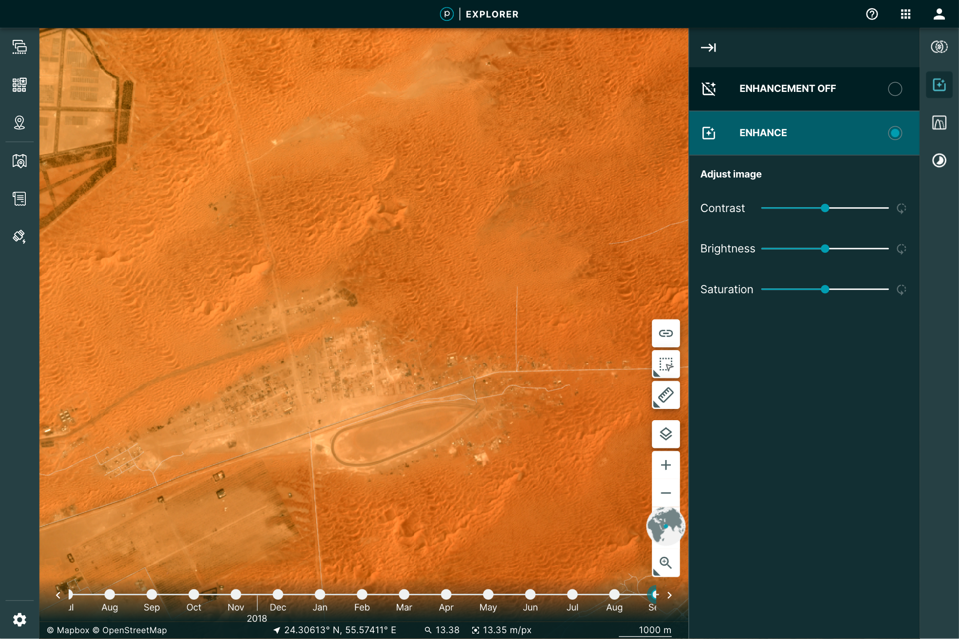 |
Even more, when you use the Image Enhancement Tool, you’re not just making a prettier picture, you’re actually doing remote sensing. This is because the image you’ve loaded is the actual data: all 12 bits per pixel. The red, green, and blue pixel data are used to display the browser-friendly colors. The other data are free to be used to perform the enhancement.
How’s it done?
Web browsers are an amazing way to get data into the hands of users. In the last 10 years, mapping applications through the browser have exploded. That explosion has pushed a number of innovations in vector formats. It has become easier than ever to take large data files of parcels, lakes, collections of millions of points, and stream them into the browser.
The same evolution has not been available to the wide range of raster data. When we display raster imagery in the browser, we’re limited to eight bits of data that define a color. This is called a true, or natural, color because it conforms to visual expectations–the colors you see in the world, for example, green grass or gray pavement. That’s what you’d expect the browser to display: the colors needed for a visual representation of the world. All web-browser image formats are limited to displaying Red, Green, Blue, and some transparency, to display that image in true color.
Remote sensing in the browser
Given that the browser is limited to eight bits for each one of these channels, we reduce the imagery’s extra bands of color and bit-depth down, by applying a “color curve” and selecting the true colors to use in the browser. Our “global” color curve is designed to work across all types of Planet data. Of course, there is no one-to-one mapping from 12-bits to 8-bits. So while the satellite is capturing lots of rich data, the global color curve addresses the most common imagery situations. This means some of that data, if it’s rarely used for representing most of the world, will not be visible in the color curve we use. Some imagery, such as the desert image above, may look washed out. But Planet's satellites are far more capable!
The imagery still has additional data that would be useful to manipulate in order to do remote sensing right in the browser. Working with only the RGB bits in the browser limits the ability to do raster-data based calculations, such as NDVI, or to see the images past that 8-bit limitation. To pass the large imagery data required for analysis to the browser interface requires getting that additional data through the network. Cloud Optimized GeoTIFFs (COGs) have helped show the potential of in-browser analysis with tools like geotiff.js. But COG's are not optimized for the web and have some limitations:
- COGs do not always have overviews. This then requires streaming the entire image into the browser from the server. Zoomed out, this means processing a lot of high resolution data for one view.
- Varying compression algorithms can create decoding issues, including overwhelming the client's CPU.
- COGs are not guaranteed to be in the same projection as the map, forcing the need for raster projection and opening the door for creating rectification issues.
- Here at Planet, we needed a technique that enables efficient streaming of multi-band, multi-byte data without the overhead of parsing a TIFF in the browser. Our solution? NumpyTiles.
What is NumpyTiles?
NumpyTiles is an open specification that Planet published on GitHub, designed to be both easy to serve and easy to parse on the client. “NumpyTiles” is a portmanteau of both “NumPy,” the popular Python numerical library, and “Tiles,” which refers to slippy-map tiles. Each NumpyTile is a NumpyArray which is 256 columns wide, 256 rows long, with any number of bands represented as additional dimensions to the array. NumpyTiles is compatible with any slippy map specification (WMTS, XYZ, TileJSON, OGC API - Tiles, etc), as it is just an alternate output format, like PNG or JPEG.
Planet open sourced OpenLayers NumpyTiles (ol-numpytiles) library to serve as a reference implementation that anyone can use. A demo of how this works can be found in the official OpenLayers examples as well as Planet Explorer.
Examples in Planet Explorer
The Enhance feature in Explorer is powered by NumpyTiles. The browser loads the images as NumpyTiles and applies the enhancements dynamically, based on the user’s viewport. This dynamic segmenting and loading provides the full range of relevant details for the pixels being displayed. The result is a more descriptive visualization of the data.
 |
 |
This is accomplished by leveraging the OpenLayer native WebGL rendering chain and lowering the amount of abstraction between “NumpyTiles” on a tile server and the rendered formats. This improved output allowed us to experiment with enhancement methods. Beyond the dynamic color curve, we could now add Brightness, Contrast, and Saturation sliders to update the image in real time, giving instant feedback to the user as to how their changes affect what they are seeing.
| No enhancement | Old enhancement | New enhancement |
|---|---|---|
 |
 |
 |
The Growing NumpyTile Ecosystem
TiTiler
Remember the old days when you prepared the raster data and then had to push a PNG of the file for display in the browser? Now, Titiler, pronounced tee-tiler (ti is the diminutive version of the french petit which means small), provides a set of simple python modules for building your own raster dynamic map tile services. TiTiler works with NumpyTiles, serving up any input data as NumpyTiles to be used in applications.
You can go even further, by using the Titiler.PgSTAC plugin to connect to a PgSTAC database and create dynamic mosaics based on a search query.
Unfolded Studio
Ready to conduct powerful geospatial data analysis from your browser? Unfolded Studio is a geospatial visualization tool that lets you create maps from your geospatial data, perform powerful analytics, share and publish maps, and much more. Check out their sample maps for inspiration. Their raster data support leverages NumpyTiles for rich interactions. This can be seen in their COG support, which uses TiTiler under the hood to convert COG’s to NumpyTiles, and their Planet NICFI integration, which uses NumpyTiles from Planet’s tile service.
Next steps
Check out the NumpyTiles spec and the OpenLayers Rendering 16-bit NumpyTiles JavaScript example. Let us know what you’re building on Twitter.
State of STAC
By: Tim Schaub on August 31 2022
STAC-ing up! We gathered statistics on over 550 million assets. Check out the summary of our project and register to be included in our next crawl.
The number of imagery providers hosting data online has increased over the years. Search interfaces and metadata formats have also grown to describe and provide access to that data. The SpatioTemporal Asset Catalog (STAC) specification aims to provide a unified framework for describing and linking to earth observation data, with the goal of increasing the interoperability of search tools and making it easier to access the data.
Since its release in May of 2021, the specification has been gaining popularity, with massive archives of publicly accessible geospatial data being hosted with STAC compliant metadata. The USGS hosts STAC metadata for the entire Landsat Collection 2 archive. Microsoft’s Planetary Computer provides a STAC API with access to imagery archives of Landsat, MODIS, Sentinel, and more.
Planet sees STAC as a key component in making earth observation data more accessible to developers, and helping advance it is a core part of our “Open Initiatives” as previously described. STAC’s adoption has felt very rapid, but we wanted more concrete metrics to establish a baseline for its actual adoption. Building up knowledge of how data is exposed as STAC can help us understand how the standard is being used and how mature various extensions are. This, in turn, can help us prioritize what we work on to increase its uptake. So to better understand how STAC is being used, we recently deployed a crawler to visit publicly accessible STAC endpoints, recording millions of statistics about the catalogs, collections, items, and assets linked from those endpoints.
STAC in a Nutshell
The STAC specification describes a few different resource types: catalogs, collections, and items. Items represent the individual spatio-temporal data entries and have references to the data assets. Collections are used to group similar items. Catalogs are the top-level entry and can also be used as sub-groupings of collections or items.
STAC implementations come with two different flavors of interface: static files and API. The static flavor can be thought of as an online folder or directory of JSON documents linking to one another. The API flavor is designed to provide more efficient pagination through large collections of items and may provide more advanced search functionality.
Crawl Summary
Starting with just 27 endpoints, sourced from the amazing stacindex.org, our crawl visited over 120 million items, spread across almost four thousand collections. We gathered statistics on over 550 million assets referenced by those items. About 97% of the collections were from static catalogs, while over 99% of the items and assets came from STAC API implementations.
| Static | API | Total | |
|---|---|---|---|
| Catalogs | 10,084 | 26,041 | 36,125 |
| Collections | 3,736 | 131 | 3,867 |
| Items | 1,077,616 | 122,258,062 | 123,335,678 |
| Assets | 1,497,447 | 550,133,772 | 551,631,219 |
The numbers suggest that people use collections far more frequently in static catalogs, presumably providing a way for users to explore reasonably small batches of items. While the STAC API implementations are dominated by catalogs with relatively small numbers of collections. Those API collections include many more items compared with their static counterparts. Because the STAC API provides search capabilities, catalogs and collections don’t need to be used as navigational aids in finding relevant items.
STAC Versions
The core STAC specification reached a stable 1.0 version in May of 2021, and the STAC API specification had its first release candidate toward 1.0 in March of 2022. Of the catalog, collection, and item resources we crawled, 88% conform with version 1.0.0. About 12% are still using version 1.0.0-beta.2. And a few stragglers are still on versions 1.0.0-rc.2, 1.0.0-rc.3, and 0.8.1.
| Version | Catalogs | Collections | Items | 1.0.0 | 35,984 | 3,258 | 108,967,770 |
|---|---|---|---|
| 1.0.0-rc.3 | 0 | 0 | 10,000 |
| 1.0.0-rc.2 | 2 | 0 | 0 |
| 1.0.0-beta.2 | 123 | 597 | 14,352,545 |
| 0.8.1 | 16 | 12 | 5,345 |
It is encouraging to see the number of implementations that comply with the stable 1.0.0 version. Perhaps those still using an earlier version have a path to upgrade.
STAC Extensions
The core STAC specification limits itself to describing the spatial and temporal aspects of the data—specifying metadata fields for the geographic location and time range associated with the data. STAC extensions provide a way to add information specific to a given domain. Extensions exist for adding metadata specific to electro-optical data, for adding additional coordinate reference system information, for adding detail about raster bands, and more.
Of the 120 million STAC items crawled, 86% referenced at least one extension to the STAC core. In total, 46 different extensions were used by the catalogs, collections, and items visited in the crawl.
This information collected on extension usage should be useful to help give real metrics to establish the proper maturity classification of proposed extensions—suggesting which might be candidates to graduate to a stable classification or which might be candidates for deprecation due to lack of use.
STAC Asset Types
Assets in STAC provide access to the underlying spatio-temporal data. For STAC items representing satellite imagery, the assets could be GeoTIFF rasters. Items may have assets that refer to additional JSON or HTML documents. The STAC asset metadata includes a “type” property advertising the asset media type. Values like “image/tiff” represent a generic TIFF image; “image/tiff; application=geotiff; profile=cloud-optimized” represents the Cloud Optimized GeoTIFF variety.
| Asset Type | Count |
|---|---|
| application/json | 101,831,216 |
| application/xml | 87,647,164 |
| image/tiff; application=geotiff; profile=cloud-optimized | 75,945,405 |
| image/png | 72,572,728 |
| image/jpeg | 50,259,307 |
| text/plain | 41,762,282 |
| text/html | 41,139,833 |
| image/vnd.stac.geotiff; cloud-optimized=true | 39,807,777 |
| application/x-hdf | 16,489,141 |
| application/netcdf | 10,252,878 |
| image/jp2 | 3,639,899 |
| application/gml+xml | 3,619,721 |
| application/vnd.laszip+copc | 3,313,116 |
| image/tiff; application=geotiff | 946,859 |
| application/x.mrf | 902,162 |
| text/xml | 620,780 |
| image/tiff | 402,485 |
| application/wmo-GRIB2 | 143,509 |
| application/x-ndjson | 143,509 |
| application/x-netcdf | 127,042 |
| (missing) | 25,051 |
| application/html | 10,000 |
| application/vnd.google-earth.kml+xml | 9,249 |
| application/gzip | 9,249 |
| application/geopackage+sqlite3 | 5,854 |
| application/geo+json | 2,846 |
| application/vnd+zarr | 1,119 |
| application/octet-stream | 569 |
| application/x-parquet | 411 |
| application/zip | 58 |
At first glance, it is surprising to see the high counts of asset types that refer to additional metadata – the “application/json” and “application/xml” asset types, for example. We had anticipated that STAC assets would refer primarily to the spatiotemporal data instead of additional metadata describing that data. As it turns out, many implementations use assets to point to additional metadata that either doesn’t fit into STAC or provides an alternate representation of the same metadata found in the STAC resources. In total, just under 50% of the 550 million assets could be classified as metadata assets as opposed to actual data assets.
Considering all of its varieties together, TIFF is the most common asset type, representing over 20% of all assets crawled. About 99% of the TIFF assets are advertised as GeoTIFFs. It is possible the remaining TIFFs are GeoTIFFs as well, but simply use “image/tiff” as their asset type. Of the GeoTIFFs, over 99% are of the Cloud Optimized variety. It appears that people are still not sure about what media type is appropriate for Cloud Optimized GeoTIFF (COG). Although there is not yet an officially specified MIME type for COGs, there is growing consensus around “image/tiff; application=geotiff; profile=cloud-optimized” as a candidate for specification.
Under the Hood
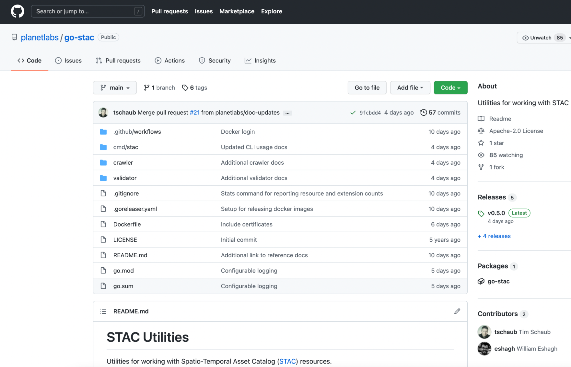
The service used to perform the crawl made heavy use of go-stac, which has been expanded with a full set of “crawler” utilities.
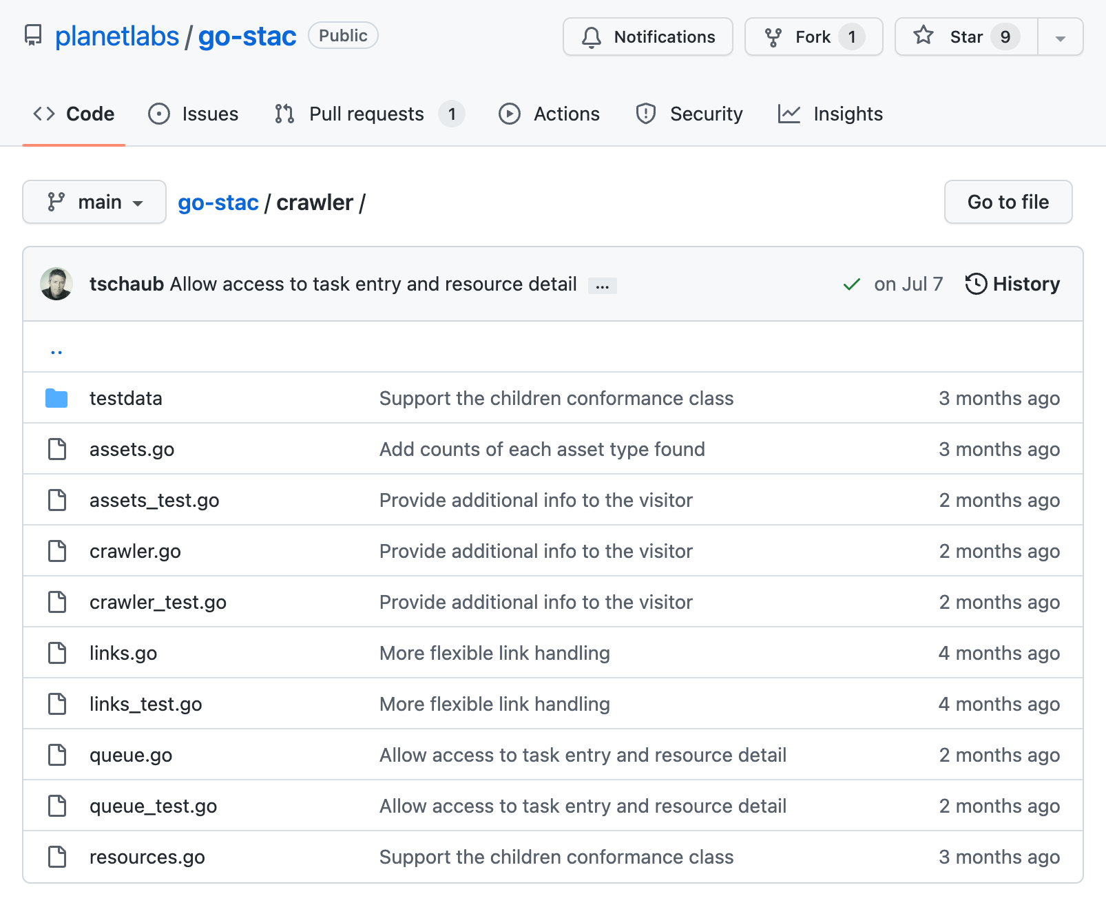
The crawling done by go-stac is now quite robust against errors and failures, and multiple end-points can be used, with a task queue to go through large amounts of data concurrently. The validate and stats commands in the go-stac command-line interface use the same crawling backend, so it’s now a great tool to use with large STAC catalogs.
The crawl results were stored in a BigQuery table, and we’ll work to make the resulting data available to the community. It will be great to see what other insights might come from this data.
What’s Next
We hope that reporting on real world implementations helps the community understand how the STAC specification is being used. We are looking forward to running another crawl and updating the results as more implementations are rolled out and the STAC spec continues to evolve.
While the linked nature of STAC makes it possible to crawl and gather statistics on publicly accessible resources, it is not the most efficient way to summarize this information – particularly for very deep collections and relatively small page sizes. We have proposed a lightweight stats extension for reporting counts of resource types, versions, extensions, and asset types accessible in catalogs and collections. In future crawls, when the crawler encounters stats like those described in the extension, it will stop crawling deeper and increment counts based on what is advertised in the stats metadata. The stats extension is not yet finalized, so try it out with your catalogs and API implementations, and share any feedback or contributions in our issue tracker.
And please upgrade to STAC 1.0.0 and STAC API 1.0.0.rc.1 and register on stacindex.org to be included in our next crawl!
Eroding Coastlines: A GeoSpatial and Computer Vision Analysis
By: Kevin Lacaille, Mansi Shah on August 04 2022
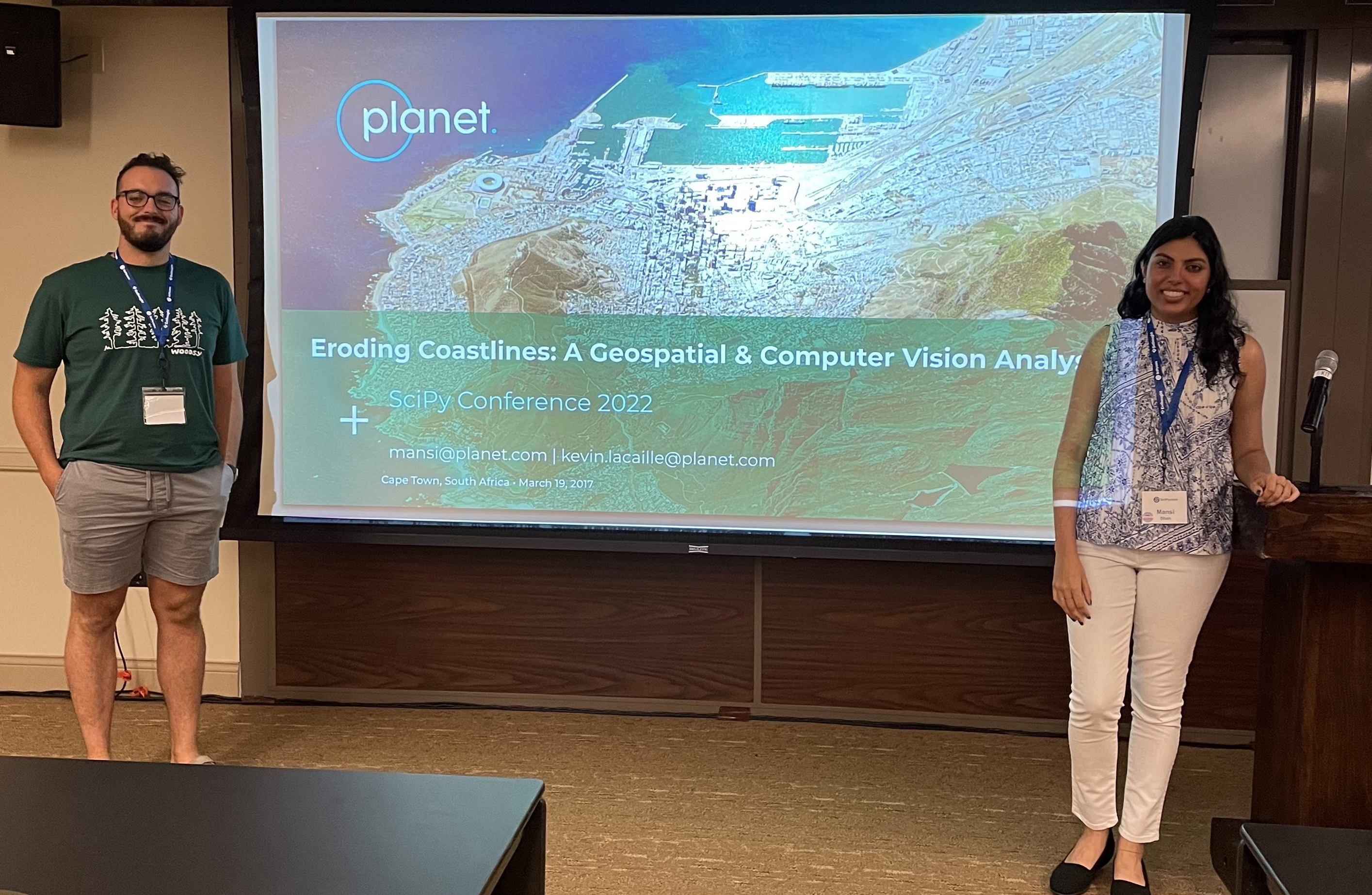
We are thrilled to announce that two of our very own DevRel software engineers, Mansi Shah and Kevin Lacaille, were selected to present a tutorial titled Eroding Coastlines: A GeoSpatial and Computer Vision Analysis at Scientific Python 2022 conference in Austin, TX.
According to their website, the annual SciPy Conference “brings together attendees from industry, academia, and government to showcase their latest projects, learn from skilled users and developers, and collaborate on code development.”
Participants of Mansi and Kevin’s workshop gained hands-on experience exploring some of Planet’s publicly-available satellite imagery using Python tools such as rasterio, numpy, matplotlib, scipy, and openCV, to analyze medium- and high-resolution imagery data. During the second half of the workshop, participants applied what they learned to identify and analyze instances of coastal erosion, one of the most pressing environmental and humanitarian challenges facing our planet today. The tutorial involved a combination of slides and hands-on, live coding with real-world publicly-available data in Jupyter notebooks – no previous experience with geospatial or computer vision Python libraries necessary.
Coastal Erosion – Why It Matters
Coastal erosion is defined as the loss or displacement of land on coastlines due to waves, currents, tide, wind, waterborne ice, storm impact, and other natural and unnatural forces. While the natural weathering of coastlines is normal, human-led activities such as coastal mining, infrastructure development, and construction can accentuate the issue. Let’s also not forget rising sea levels are a result of climate change. The IPCC states with high confidence that the Global Mean Sea Level (GMSL) has risen 3.6mm each year, on average, from 2006-2015. Risk related to sea level rise, including erosion along all low-lying coasts, is expected to significantly increase by the end of this century without major additional adaptation efforts. Long-term impacts of coastal erosion include loss of habitat quality, degradation of coral reefs, increased turbidity of water, reduced tolerance for communities in the face of natural disasters, and reduced sand volume. These environmental impacts are in addition to the millions of dollars lost and spent annually on coastal property loss, tourism collapse, and erosion control measures in the U.S. alone.
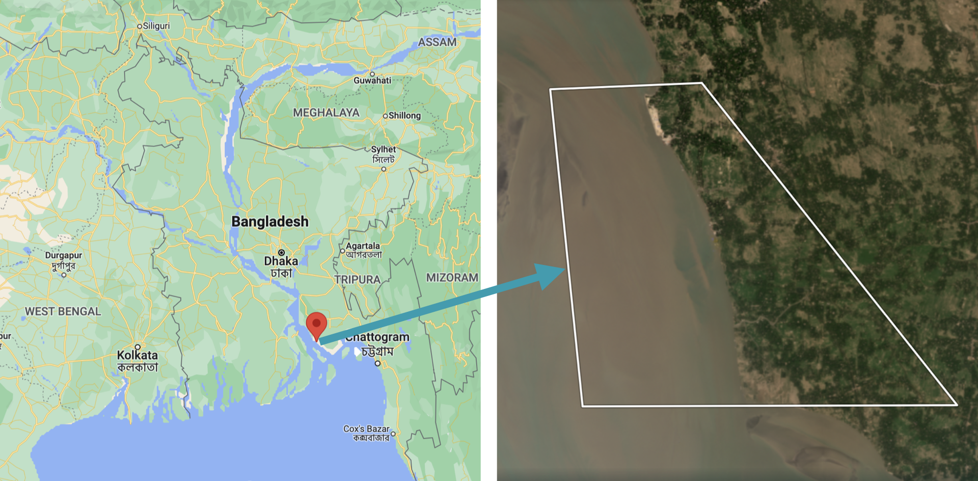
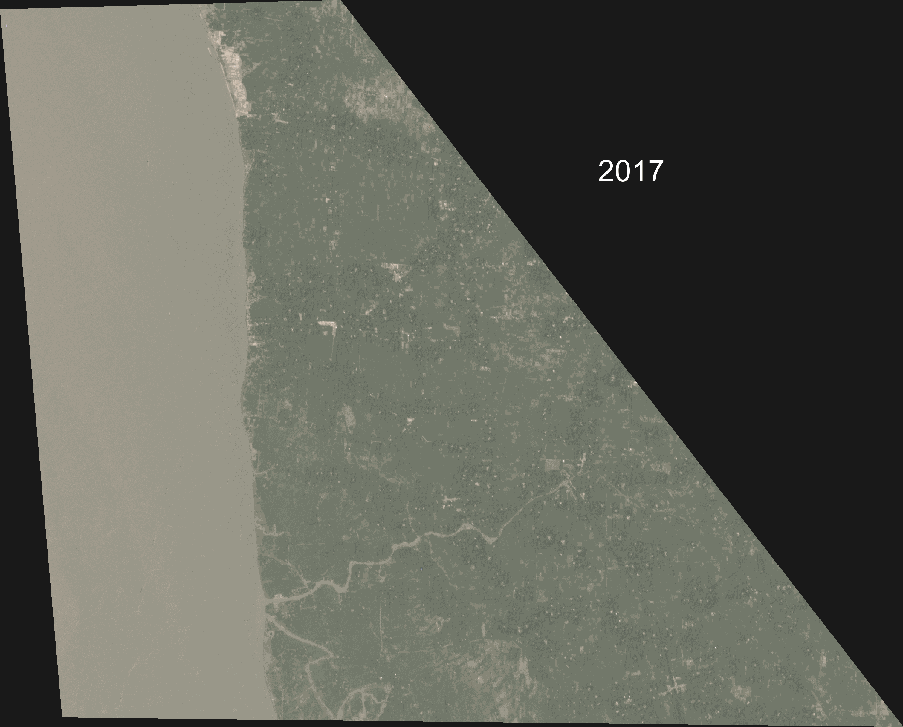
Inspired by Crawford et. al (2020), the case study for this tutorial analyzed a severe example of coastal erosion, centered on a small, 7 km (4 mi), coastal region in Kamalnagar, Bangladesh. This region is located in Southern Bangladesh, where the ocean (Bay of Bengal) meets a major inlet, the Meghna River. Coastal erosion in Bangladesh is a recurring problem, causing thousands of people to be displaced annually. In fact, coastal Bangladesh experiences erosion rates that are among the highest in the world.
The workshop began with some geospatial and computer vision techniques, then moved on to apply those techniques to detect and analyze coastal erosion. The workshop focused on:
- extracting data from multi-band imagery
- computing the normalized difference water index (NDWI)
- using the NDWI to identify regions of water and land within the area of interest (AOI)
- applying classical image processing and computer vision techniques to analyze coastal erosion
The folks attending the workshop created a data and image processing pipeline. Then they detected and measured the effects of coastal erosion in Kamalnagar, Bangladesh. They found that over the past 5 years the land had receded about 2 km (1.2 mi) and that the region had lost about 11 km2 (2742 acres) of landmass. On average, this translates to the region losing about 400m (1300 ft) of coastline and about 2.2 km2 (550 acres) of landmass, each year. In addition to identifying coastal recession, our analysis showed that the recession was speeding up year-over-year, consistent with what the authors of Crawford et. al (2020) had found.
The workshop demonstrated that not only can geospatial data be beautiful, but it can also be used for great scientific purposes. In this case, it can be used to identify areas critically affected by natural disasters, which are prime candidates for humanitarian aid.
Planet & Environment
Our planet is important to us. One of Planet’s ethical principles is to protect the environment: “we actively develop and support uses of our data, products and services that address the critical planetary crises of our time, from climate change to the loss of nature.” This carries into our work in Developer Relations. We reflect this deep care for the environment in our work. Whether our tutorial attendees are environmental scientists, geospatial experts, or completely new to the field, a key part of our role on team DevRel is to engage and empower developers. At Planet, we enable technical users to do amazing and intentional things with our data. We’re here to support the search for answers.
Next Steps
Kevin and Mansi were excited to engage with users of Planet’s data and the broader Python developer community around technical topics and environmental issues that matter. This was Planet Developer Relations’ first in-person presence at such a conference since 2020. We’re looking forward to reconnecting with old connections and building new ones. And we hope to see you there! Mansi Shah and Kevin Lacaille presented their tutorial at the SciPy 2022 conference in Austin, TX on July 11, 2022 from 8:00am-12:00pm CDT. Watch their presentation on YouTube. Try your hand at the Coastal Erosion Jupyter Notebook.
Planet and Cloud-Native Geospatial
By: Chris Holmes on May 26 2022
Planet and cloud-native geospatial open source
After Sara’s announcement of our new blog, I have the honor of writing the second substantive post on this blog. I’ve been at Planet for a long time and have always felt developers are our most important users. So I’m pleased to share that just recently I shifted my role to become the Product Manager of the Developer Relations team that Sara leads. Most exciting for me is that we’ve expanded the scope of the team to include what we call “Open Initiatives,” one of which is “Cloud-Native Geospatial,” encompassing all the work I’ve been doing on things like SpatioTemporal Asset Catalogs (STAC) and Cloud-Optimized GeoTIFFs (COG), plus new topics like GeoParquet.
A lot of my time recently went into organizing the Cloud-Native Geospatial Outreach Event that happened last month. Planet was a top sponsor, and a number of Planeteers gave talks. It’s super cool to watch the videos of the talks and to see how the community just continues to explode. With over 1600 registrations, I think we’ll see another jump in momentum after the event. I wanted to share a bit about Planet’s pioneering role in Cloud-Native Geospatial, as well as what we’re working on next and why we’re excited about this great ecosystem.
Planet and the genesis of Cloud-Native Geospatial
Planet was lucky to be among the first “cloud-native” satellite imagery providers (perhaps even the first). It was really a matter of timing, as Planet was founded right when any sensible Silicon Valley startup trying to achieve scale moved to the cloud. At that time, a standard image processing pipeline would involve image processing experts using desktop software to produce the imagery for customers. But Planet had huge aspirations of scale, with the mission to “image the whole earth every day” at the center of what everyone did. The amount of data coming in from Planet’s planned constellation meant that everything needed to be automated. So Planet just built its data pipeline and data hosting platform out right, and became a big supporter of the “cloud-native geospatial” movement before it even had a name.
The movement clearly started with the advent of the Cloud-Optimized GeoTIFF, which Planet played a key role in creating. The idea behind COG was discussed and built out in the AWS Landsat Public Dataset project, with Planet as a key contributor. Then it came together as a standard in a meeting I remember at Planet headquarters. We had a whiteboard session with Frank Warmerdam of GDAL fame, Matt Hancher who co-founded Google Earth Engine, and Rob Emanuele who led RasterFoundry at Azavea and now leads engineering on Microsoft Planetary Computer. We wanted a format that Planet could produce and that would be streamable into these two new cloud-native geospatial compute engines. And one that is ideally backwards compatible with a standard GeoTIFF, so it would still work for local workflows. Planet then funded Even Rouault to create the original specification and document the GDAL drivers.
Planet also worked on the evolution of SpatioTemporal Asset Catalogs (STAC), which started when Radiant Earth convened a diverse group of geospatial experts and organizations in Boulder, CO to collaborate on the interoperability of data catalogs. I recently posted on the history of Planet’s support of STAC. Planet’s role in STAC is one of the things I’m most proud of, and it’s fun to see it integrating into Planet’s API’s.
Why we support Cloud-Native Geospatial
Planet supports cloud-native geospatial because our imagery must be much more accessible to have the impact we aspire for. I’d like to explain a bit more as to why we support this ecosystem.
There are two critical economic shifts transforming the world:
- The Digital Transformation, where organizations are using Big Data and Artificial Intelligence to understand what they do and to do it more efficiently
- The Sustainability Transformation, where data about our planet is key to valuing natural systems in the economy
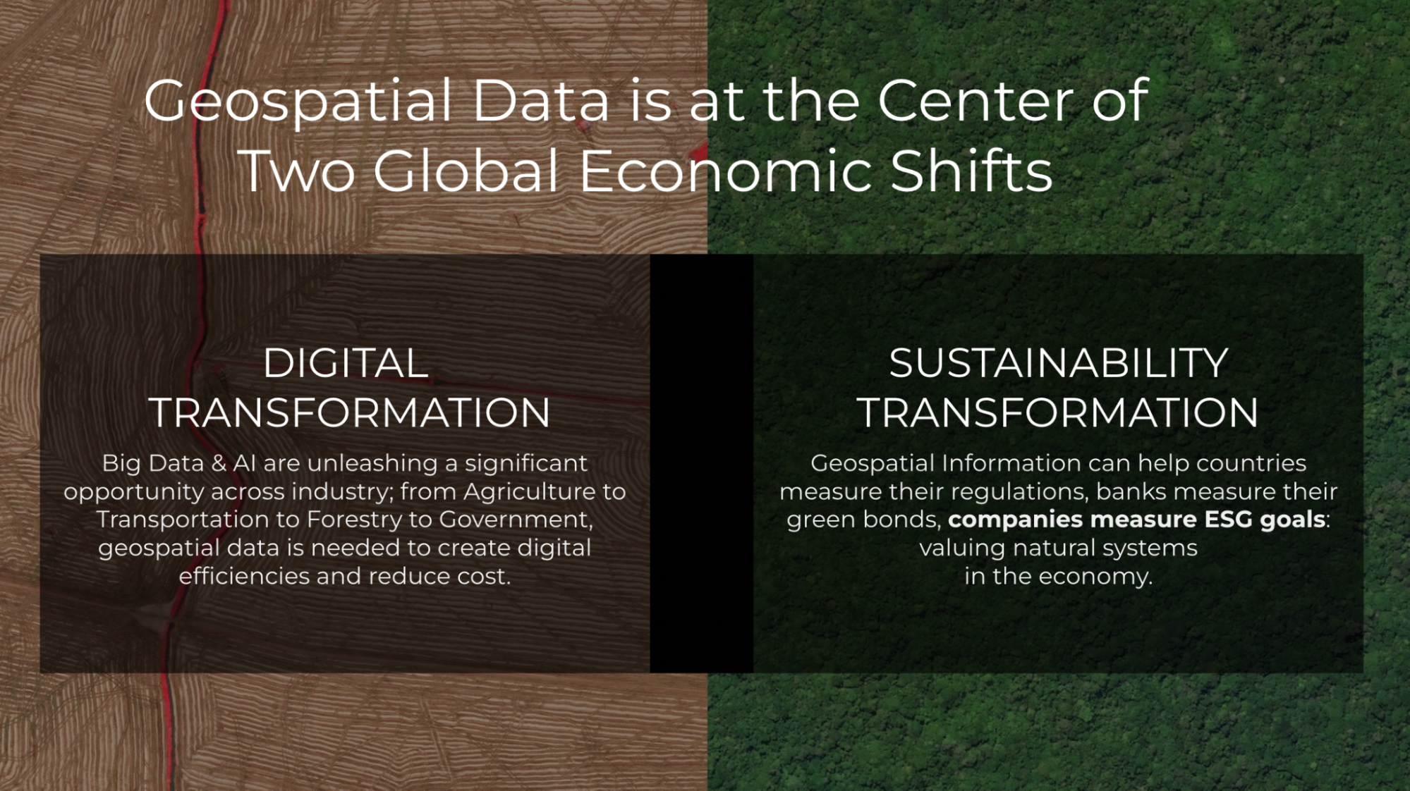
Geospatial Information is useful for many organizations found in either or both of these movements. But the benefit will not be realized if everyone must become experts in remote sensing and GIS. It is incumbent upon us to make information about the earth accessible and integrated into the workflows people use everyday. And the biggest challenges always need more data sources, combined in insightful ways. Planet’s APIs and data formats need to be in the formats, tools, and channels used to create solutions that make a difference.
Cloud-native geospatial has the potential to make geospatial data far more accessible within existing workflows and architectures. By doing so, users don’t need to be experts in remote sensing and GIS. They just need to understand how to work with data.
Making Planet’s data more accessible to developers
Planet is working hard to ensure the developer experience is as solid as possible. The headline news of 8-band data availability is certainly cool, but what I’ve personally found especially impressive is how the team has greatly improved the quality of the imagery and reduced the complexity to access it. Improvements in our data pipeline include better alignment between pixels, a reduction in the number of artifacts, and a sharpening of the visual quality. And the new PSScene product simplifies and future-proofs how users and developers access imagery. Not quite as new, but seeing substantial adoption, is the Subscriptions API, which greatly simplifies the development time to integrate any monitoring workflow with Planet. Another great feature is the new harmonization tool, one of the key operations for Planet’s delivery tools in providing full Analysis Ready Data in an On-Demand workflow. Together these improvements are a huge step towards data that “just works,” enabling developers to order a atmospherically-corrected, pixel- and sensor-aligned stack of imagery for time series analysis without having to even think about all the complexities of remote sensing.
The next frontier in making Planet even more accessible to developers is the higher level data products that directly extract insights from satellite imagery. For example, Planet offers our Road and Building Change Analytics and what we call “Planetary Variables”, including Soil Water Content, Land Surface Temperature, and a proxy for Vegetation Biomass. These Planetary Variables go beyond just Planet’s imagery, fusing several different data sources, and will open up new use cases. Planet moving further up the stack, and into the “vector” area of geospatial, means much more access for new developers. And there are some interesting interoperability opportunities that we hope to contribute to.
What’s next for Planet and Cloud-Native Geospatial?
Planet data generates far more insight when it can be combined with other data. So we believe in helping create an ecosystem of tools and data that have interoperability at their core. One route is supporting tools like GDAL and Rasterio, which translate between any format. Another route is work toward the interoperability of the next generation of workflows, as COG and STAC do.
Building our team
Planet has recently been increasing its resources working on developer relations and cloud-native geospatial, including bringing on folks to work full-time on “open initiatives.”
- Sean Gillies joined the developer relations team a few months ago. Planet is supporting his time on Rasterio, Shapely, and Fiona—some of the most important geospatial tools in the Python ecosystem. The other project he’s helping out on is a new version of Planet’s Python client and command-line library, which you’ll hear about soon on this blog.
- Tim Schaub is one of the best developers I’ve worked with. You may know him as a leader of the open source OpenLayers JavaScript toolkit that Planet uses extensively. Tim has been going deep on Go, helping build Planet’s multi-source ARD product called “Fusion Monitoring.”
The developers relations team has also had a number of other great new hires, who you’ll hear from on this blog.
COG and STAC
In order for cloud-native geospatial to reach its full potential, COG and STAC will have to “cross the chasm” to mainstream adoption. To do so, we want to help everyone get a sense of just how much data there is in STAC and COG. If we can’t measure how much data is available in these new formats then we won’t be able to actually track progress and determine which of the various initiatives are working. To start, we’re focused on a crawler pointed at STAC Catalogs that reports back stats on the number of STAC Items, STAC Extensions used, and what format (COG, JP2K, Zarr, etc.) the assets are stored in. This, in turn, will help inform a new STAC extension making reporting easier, so we’re not having to hand crawl tens of millions of STAC records. We hope to report on the overall STAC and COG data holdings that anyone can access. We’ll work to integrate with STACIndex.org, which is where this idea originally came from.
To support this, Tim has revived the Planet go-stac open source library, getting it up to speed with STAC 1.0.0, and improving its crawling and validation capabilities. It’s now capable of very fast recursive crawling, with more improvements coming soon.
We are also starting to use the library internally to build and deploy Planet’s STAC Catalog of open data.
Cloud-Native Vector
Another area where we’ll be focused is the standards that can make our higher-level “Planetary Variables” data more interoperable. The goal is to have these available in “vector” data formats—the points, lines, and polygons that can be represented as rows in a database. Indeed, one end goal would be delivering daily information as simple tabular values against known geometries. This would mean a user already has the geometry of a state, county or even a field and they’d just get a daily update—say, of the plant biomass or soil moisture reading for the day.
Cloud data warehouses like BigQuery, Snowflake, and Redshift are driving a revolution in how organizations handle all of their data, and all have native geospatial support. So there is an opportunity to fit Planet’s daily variables about our earth directly into the workflows being used today. This has led us to helping seed efforts like GeoParquet. Javier de la Torre, from Carto, wrote a great overview introducing GeoParquet. Planet is working to build the community and the specification, and we funded the development of the GDAL/OGR reader that is included in GDAL 3.5.0. An interoperable format would enable us to publish data once and stream to a variety of cloud tools.
Next step: Join us
We’ve gotten this far by collaborating with others, and I think the opportunity to make geospatial more accessible is limitless. We hope others will join us in open collaboration. If you’d like to continue to get updates on what we’re up to in cloud-native geospatial, as well as all kinds of content about our API’s, tools, and the geo technical developer community in general, please follow our blog. And do check out our contributions to the Cloud-Native Geospatial Outreach Event, see the playlist on youtube for all the content.
Forward-looking Statements
Except for the historical information contained herein, the matters set forth in this blog are forward-looking statements within the meaning of the "safe harbor" provisions of the Private Securities Litigation Reform Act of 1995, including, but not limited to, the Company’s ability to capture market opportunity and realize any of the potential benefits from current or future product enhancements, new products, or strategic partnerships and customer collaborations. Forward-looking statements are based on the Company’s management’s beliefs, as well as assumptions made by, and information currently available to them. Because such statements are based on expectations as to future events and results and are not statements of fact, actual results may differ materially from those projected. Factors which may cause actual results to differ materially from current expectations include, but are not limited to the risk factors and other disclosures about the Company and its business included in the Company's periodic reports, proxy statements, and other disclosure materials filed from time to time with the Securities and Exchange Commission (SEC) which are available online at www.sec.gov, and on the Company's website at www.planet.com. All forward-looking statements reflect the Company’s beliefs and assumptions only as of the date such statements are made. The Company undertakes no obligation to update forward-looking statements to reflect future events or circumstances.