Time to complete: this tutorial is expected to take anywhere from 30 minutes to 2 hours depending on your QGIS and satellite imagery familiarity.
In this tutorial, you will learn how to explore Planet Analytic Ship Detection Feeds, visualize Collections over your AOI and derive insights from them using QGIS.
Make sure to review our public Analytic Jupyter Notebooks for more knowledge on retrieving Collections from different Feeds.
What will you need?
We will be using Python 3+ to download Collections using the Analytics API with a Jupyter Notebook. Therefore, make sure the requests and notebook packages are installed.
We will use QGIS v3.10, which is the most stable and recommended version at time of creation of the tutorial. And for plotting, we will be using Plotly, which extends QGIS native plotting features. The plugin can easily be found and installed from the QGIS plugin manager.
You will also need to make sure you have a Subscription to Planet Analytic Vessel Detection Feeds, although a subscription for Airplane detection should work too. If you don't have one, you can contact our Sales team to request trial access.
But, what are Analytic Feeds?
Planet Analytics leverages machine learning and computer vision techniques to extract critical objects and features from Planet imagery, providing customers with deeper insights at a higher frequency than ever before.
Currently, insights are delivered in the shape of raster layers for Buildings and Roads detection Feeds while Ships and Airplanes detections are packaged as GeoJSON FeatureCollection objects.
A final note before we start: You have probably noticed that the words Feeds, Subscriptions and Collections on this tutorial have been consistently emphasized. That is because they are important concepts that we need to know to understand how Planet Analytics work. Let's define them:
- Feeds: an analytic derived from Planet imagery.
- Subscription: the access you will have to a Feed in terms of an Area of Interest (AOI) and Time Interval of Interest (TOI).
- Collections: Analytic outputs from Planet’s computer vision models.
Learn more about Planet Analytics here.
Let's Download the data
Tip:
The code found in the following section is extracted from a this Jupyter Notebook; view that Notebook for additional details.
To create a new Jupyter notebook and run the following code blocks in iPython cells, simply run the following command from a terminal:
jupyter notebook
Retrieving subscriptions
Using your Planet API key, make a call to the Analytics API to GET all of your subscriptions.
import os
import requests

# Build URL for the Subscriptions endpoint
BASE_URL = "https://api.planet.com/analytics/"
subscriptions_list_url = BASE_URL + "subscriptions"

# construct auth tuple for use in the requests library
BASIC_AUTH = ("PASTE YOUR API KEY HERE", "")

# Make GET call
response = requests.get(subscriptions_list_url, auth=BASIC_AUTH)

# Parse JSON response into a variable
subscriptions = response.json()["data"]

# List all subscriptions by name and ID
for s in subscriptions:
    print("Subscription name: {}, ID: {}".format(s["title"], s["id"]))
Now, let's pick a Subscription to pull results for and use it for our example. Copy the chosen Subscription ID and paste it inline on the code below.
import json

subscription_ID = "PASTE YOUR SUBSCRIPTION ID HERE"

# Construct the url for the subscription's results collection
subscription_results_url = BASE_URL + 'collections/' + subscription_ID + '/items'

# Get subscription results collection
resp = requests.get(subscription_results_url, auth=BASIC_AUTH)
if resp.status_code == 200:
    subscription_results = resp.json()
else:
    print('Something is wrong:', resp.content)
Setting Collections Time of Interest (TOI)
Let's define a time window to look for Collections. In the code below, we will use a 60 days window, but you can edit that parameter to include Collections on less or more days.
from dateutil.parser import parse
from datetime import timedelta, datetime

# Let's first grab the latest published features
results = sorted(subscription_results['features'],key=lambda r: r["properties"]["observed"], reverse=True)
latest_feature = results[0]

# And set the END_DATE of our timeframe to that latest date (We need to use Date objects here)
end_date = parse(latest_feature['created']).date()
print('Latest feature observed date: {}'.format(end_date.strftime("%Y-%m-%d")))

# Set our date filter to START N days prior to the latest observed date. Change *days=N* to your desired number of days
start_date = latest_date - timedelta(days=60)
print('Aggregate all detections from after this date: {}'.format(start_date.strftime("%Y-%m-%d")))
Get Collections
Now, let's apply the time window filter above and iterate through all the pages of our Subscription results.
# Helper function for paginating API response
def get_next_link(results_json):
    for link in results_json['links']:
        if link['rel'] == 'next':
            return link['href']
    return None

# GeoJSON object to populate with detections
feature_collection = {'type': 'FeatureCollection', 'features': []}
next_link = subscription_results_url

# Iterate through all pages of subscription results
while next_link:
    results = requests.get(next_link, auth=BASIC_AUTH).json()
    # Sort features by observed date, descending
    next_features = sorted(results['features'],key=lambda r: r["properties"]["observed"], reverse=True)
    if next_features:
        # Add only the features 1 day before end date.
        for f in next_features:
            if (parse(f['properties']['observed']).date() >= start_date and parse(f['properties']['observed']).date() < end_date):
                feature_collection['features'].extend([f])

        # Check if there are more features within the requested time period on the next pages
        latest_feature_creation = parse(next_features[0]['properties']['observed']).date()
        earliest_feature_creation = parse(next_features[-1]['properties']['observed']).date()
        if earliest_feature_creation >= min_date:
            print('Fetched {} features fetched ({}, {})'.format(
                len(next_features), earliest_feature_creation, latest_feature_creation))
            next_link = get_next_link(results)
        else:
            next_link = False

    else:
        next_link = None

print('Total features: {}'.format(len(feature_collection['features'])))

# Create downloading directory
if not os.path.exists("data"):
    os.mkdir("data")

# Save features as GeoJSON file
filename = 'data/collection_{}_{}.geojson'.format(subscription_ID, start_date.strftime("%Y%m%d"))
with open(filename, 'w') as file:
    json.dump(feature_collection, file)
    print("File saved at {}".format(filename))
Let's visualize the data in QGIS
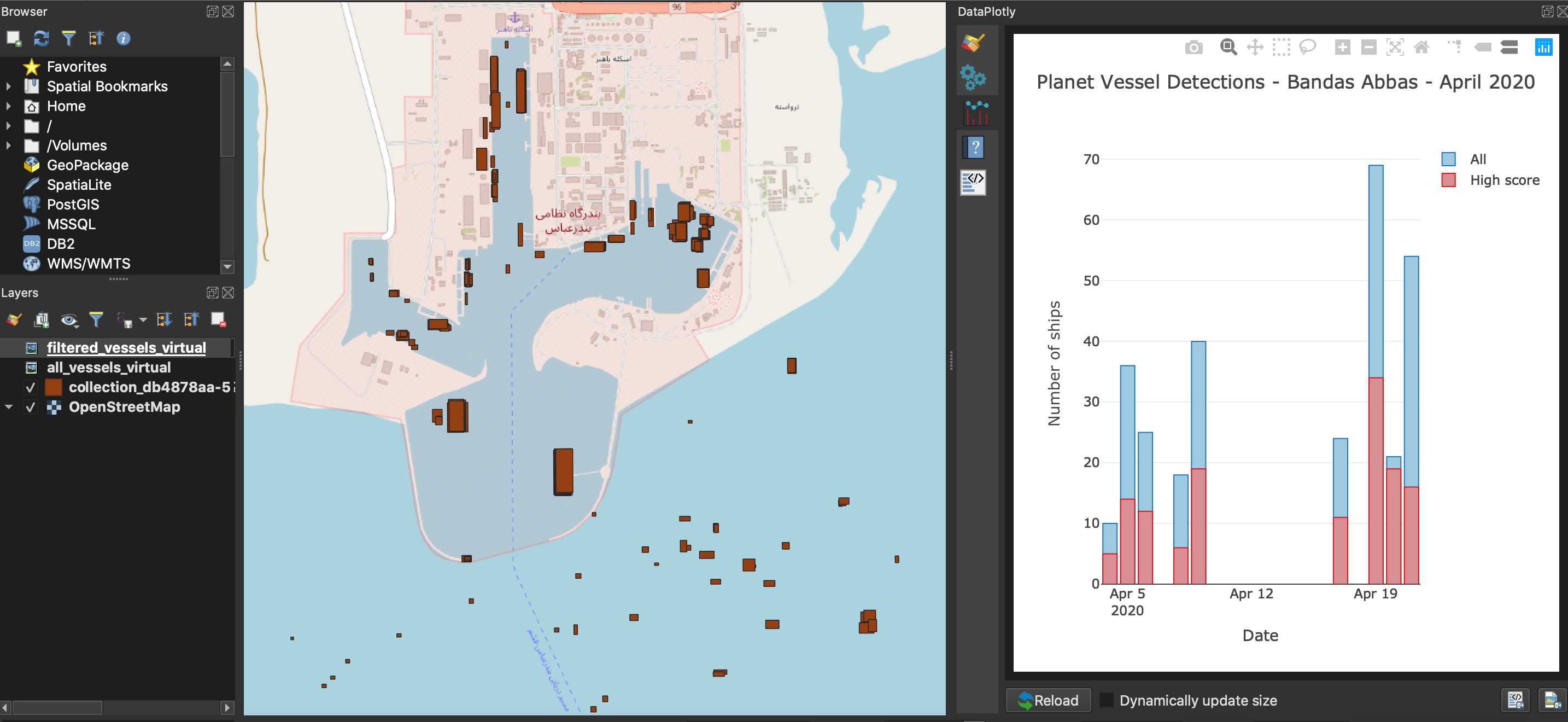
Go over to your QGIS Desktop, load your preferred Basemap layer, such as OSM standard, and add the recently downloaded GeoJSON with our set of Collections.
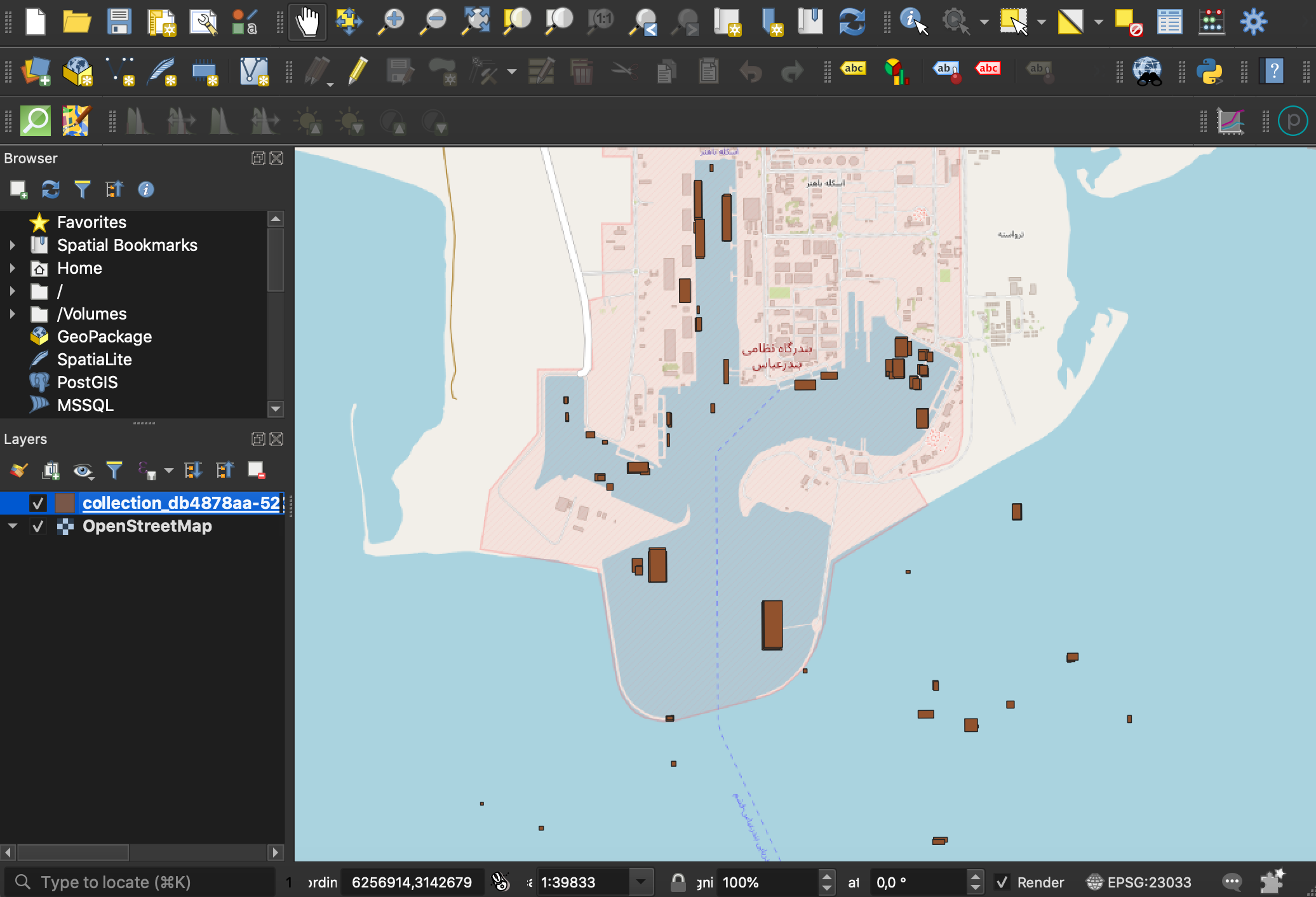
Data preparation
As you can see, this dataset contains all of the Ship detections observed through out the last 10 days on our Area of Interest (AOI). Although already helpful, the dataset is not filtered nor categorized, so understading insights such as daily activity on the port might be not straightforward. In order to create better visualizations from this data and make that understanding more direct, we'll need to do some data shaping.
For instance, since we want to plot detections per day, it would look nicer if our timestamps contained only date information. We can get that information simply by parsing the dates from the existing observed field.
In QGIS, open the Collections attribute table and make the layer editable (1). Then go ahead and open the Field Calculator tool (2).
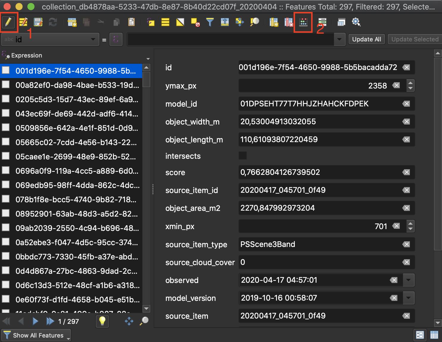
Let's use add the conversion function to_date() to convert the datetime objects stored in the field Observed into date-type objects saved on a new field called date.

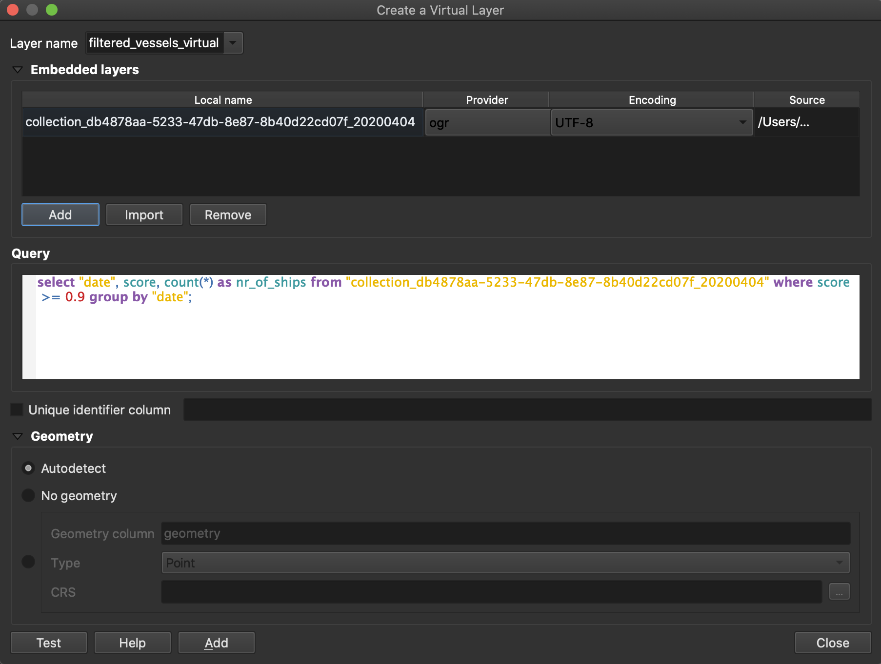
After we saved the changes to the layer, we need to group all the detections daily using the field we just added. To do that, we will make use of Virtual Layers.
Go over to Layer > Create Layer > New Virtual Layer. On the new window, give your Virtual Layer a name. On the Embedded layers section, click on import to load our Collections layer (1). On the Query section, copy the following SQL statement using the name of your Collections layer (2). Click on Add to add layer to our Map extent.
select "date", count(*) as nr_of_ships from "YOUR_COLLECTIONS_LAYER" group by "date";

Planet's model performance for Vessel dections is around 70% in precision, recall and F1. Hence, we recommend the product to be used for applications in conjunction with other data sources. To make our visualisation more insightful, we can also create a virtual layer to show only those detections where we are mostly sure the objects detected are ships, i.e., those where the confidence score is more than 90%.
Repeat the previous step, go to Layer > Create Layer > New Virtual Layer and use the following SQL query:
select "date", count(*) as nr_of_ships from "YOUR_COLLECTIONS_LAYER" where score >= 0.9 group by "date";
Data visualization
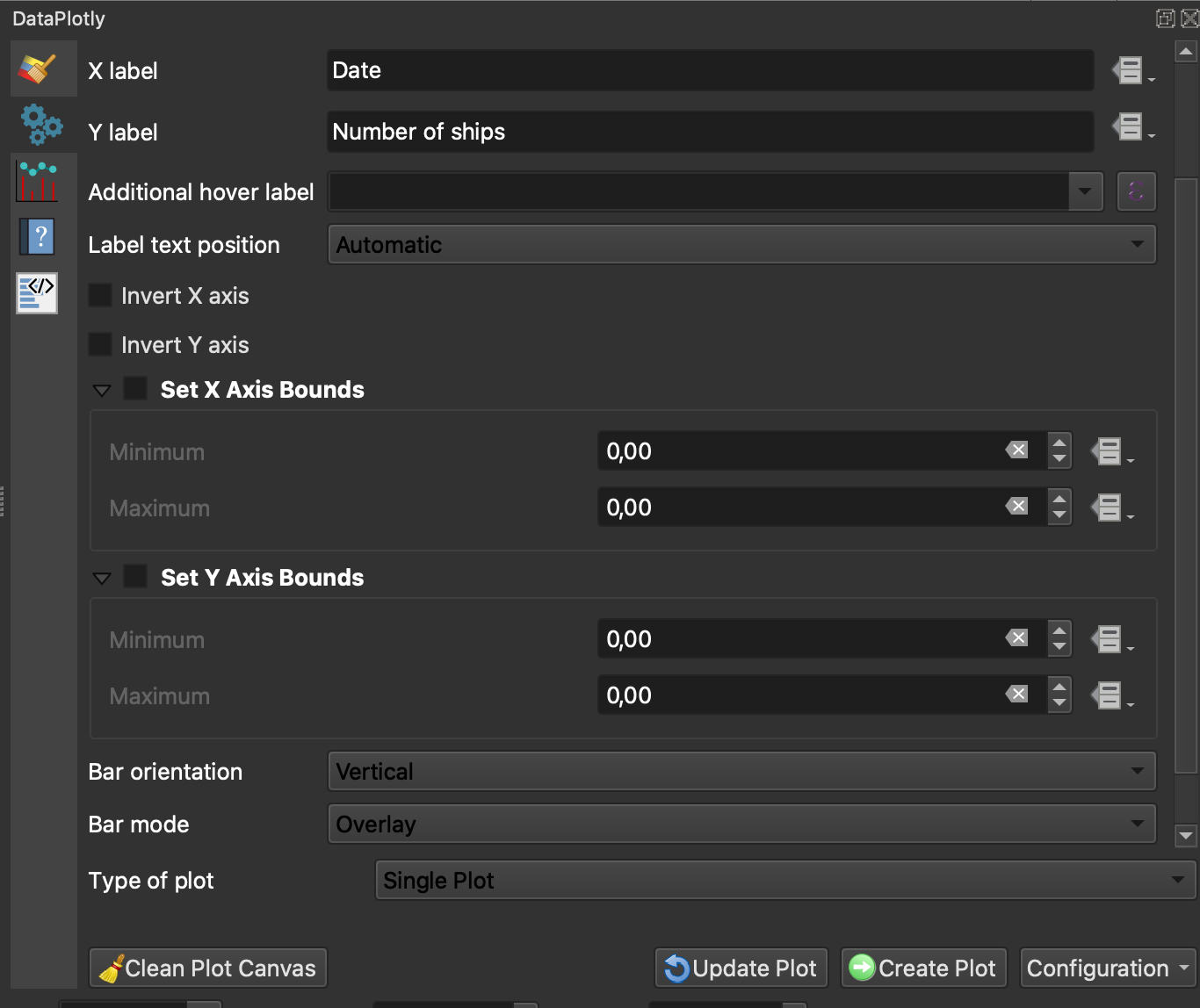
Now that we have the data in the shape we want it, let's use Plotly to create subplots for both our virtual datasets. Once installed, a Plotly button will appear on the top right side in your panels. Click on it to start plotting.

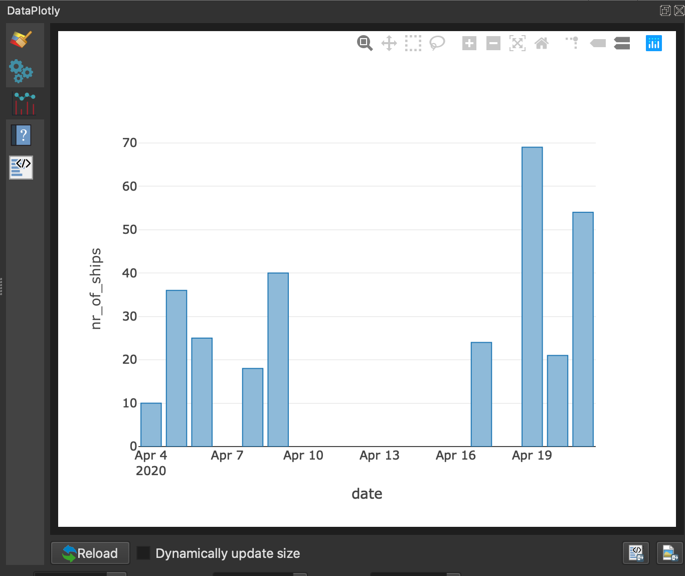
First, let's visualise all of the detections using a bar plot, so make sure that option is selected as Plot Type. On the Plot Parameters section, select the All_vessels virtual layer we just created. We want to plot the number of ships detected (Y-axis) on a daily basis (X-axis) for our complete TOI.
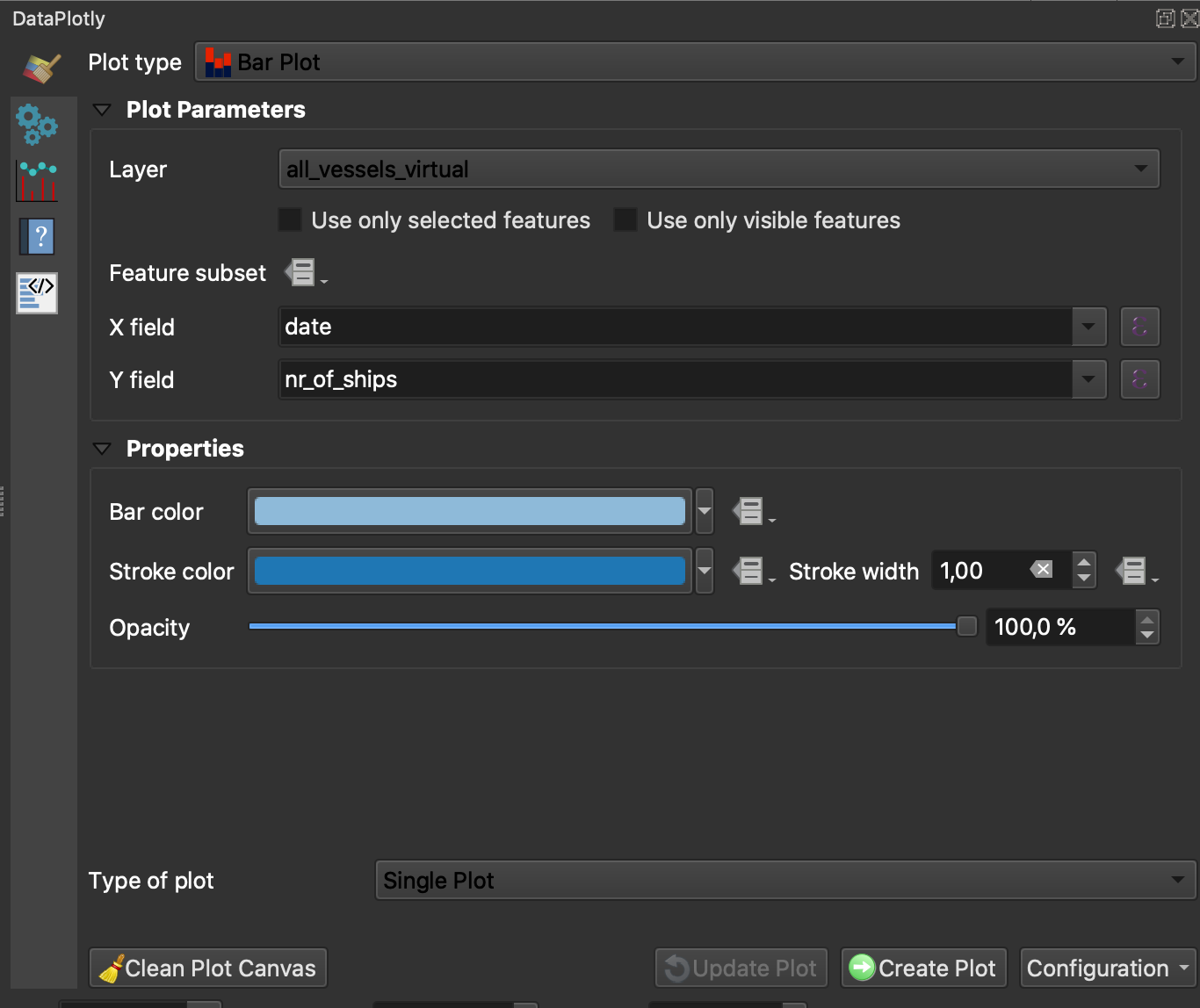
Hit Create Plot to get our first graph.
Now, let's add the graph for all the high confidence detections. On Plotly, repeat the steps above but this time selecting our Filtered vessels layer. Choose a different color for the new bar graph for contrast.

Hit Create Plot to add the second plot to our main graph.
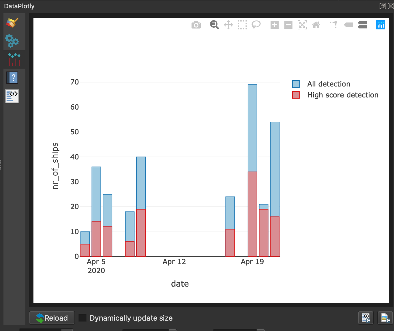
You can always modify your plot Settings within Plotly. For instance, for the plot above, we decided to overlay our bars instead of stacking or grouping them.
And that's it! Now, you can easily visualize daily activity over your port of interest by leveraging Planet's high frequency imagery, high performance machine learning models and open source QGIS tools. You can export these plots also as more interactive ´.html´ files that can be pasted within reports, in web applications or slides decks to share.
Rate this guide: