Overview
So you’ve downloaded your first Planet image. There’s something on your computer that came from space. Cool! So now what?
Well, first things first: look at it! If you open it in Windows Picture Viewer (WPV) or Apple’s Preview, the image may look totally black. Don’t worry, it’s not broken! That’s just an analytic file appropriate for scientific applications, and WPV & Preview expect 8- or 16-bit images. The values in the analytic file can be scaled in a program like Photoshop or GIMP, or opened and scaled in GIS software like QGIS. But if you want something that looks like what you expect out of the box, download the visual file instead.

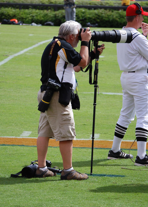
So now that you can see something, you may wonder what you’re looking at. Well, imaging satellites have digital cameras attached to telescopes - like a sports photojournalist's setup, but in space!
These cameras are fancier than cell phone cameras, but the pixels you see when you zoom into a selfie are the same type of thing you see when you zoom into a satellite image. They represent the intensity of light reflected off the objects the camera was pointed at. As an aside, Planet’s cofounders actually launched a cell phone to the edge of the atmosphere, and recent phone sats even captured photos!
The main difference between Planet’s cameras and a photojournalist’s is that our camera is sitting in space and pointing at the ground. Oh, and it’s surrounded by lots of electronics to help it understand where it is, stay there, and transmit images to the ground. Because we know where the satellite is pointing and the height of the orbit, we know that each pixel represents a specific place and covers 3 to 5 meters on the ground - depending on the orbit and the length of the telescope. This helps us put images on a map, like what you see in Google Maps.
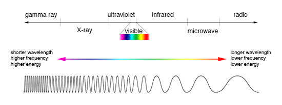
Anyway, an image contains some combination of bands, or data “layers”, that represent each of the different wavelengths of light recorded by the sensor. Planet’s satellites record red, green, blue, and near-infrared (NIR) light reflecting off the ground. Even though our eyes don't see it, near-infrared (NIR) light provides extremely helpful information! Our RapidEye images capture NIR as well as red edge information, which falls between "pure" red and NIR. People are most familiar with RGB images, because that’s what we see out in the world. You can see where visible light appears in the electromagnetic spectrum in the figure below.
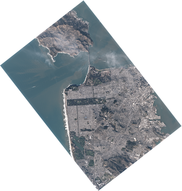
This image of San Francisco shows that Golden Gate Park reflects a lot of green light and absorbs red and blue light (which makes it look green to us). Seafoam along the western coast reflects red, green AND blue light (which makes it look white to us).
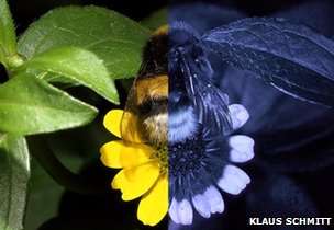
Other satellites and instruments record light in different parts of the electromagnetic spectrum, including ultraviolet or thermal infrared. Bees can even see ultraviolet light!
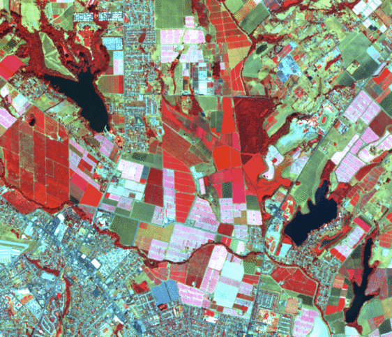
Interestingly, chlorophyll reflects a lot of near-infrared (NIR) light, which means it’s useful for highlighting plants. Water absorbs NIR light, so it’s easy to distinguish green water from green plants. Check out the image below - it alternates between a normal RGB image and a false-color image created with NIR, red and blue bands. That green lake in the upper left looks a lot like the green forest NE of center - except when you look at the false color image: the lake looks black, while the dense forest is dark red. As you might imagine, this is really useful for agricultural applications - like checking crop health (more chlorophyll = healthier growth) - or tracking deforestation.
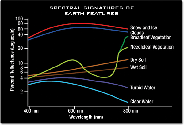
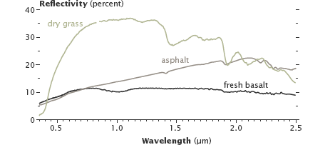
Other materials reflect different wavelengths of light in different ways. The graphs below show the spectral signatures of different features you might see in a satellite image (see Figs. 6 & 7). We can use these spectral signatures to classify different types of features on the ground. The graphs below show the amount of light reflected off a particular surface at a particular wavelength of light.
So what can you actually see in our imagery? Look for patterns across a landscape? Measure urban growth? Track fires, sandstorms, floods? Do you know what to look for? This NASA guide offers useful tips for visually inspecting and interpreting images - no code necessary!
The most interesting thing about our imagery is the fact that it is updated so often. Because we have so many satellites in space (137 at the time of writing, but we're launching more soon), we can image the same place frequently. Once our full constellation is launched later this year, we’ll be imaging the entire world every day. So we’ll be able to watch crops grow, buildings appear, or deforestation spread - all as it happens. No one has been able to do that in such detail before, so we’re very excited about the possibilities.
Next Steps
If you're familiar with REST APIs, you can jump directly to our API Quickstart guides to get up & running with Planet's public data API. If you need an introduction to APIs, start here.
Rate this guide: